

HOSS
TL;DR
HOSS is a nonprofit that assembles and distributes hygiene kits to underserved populations. Every kit goes out through a partner clinic that already has an identity of its own. So the deliverable was a modifiable color system to fit the brand identity.
2025
Project Type
Pro bono, for a nonprofit founded by a friend.
Role
Sole designer on the identity, working directly with the founder.
Logo Design
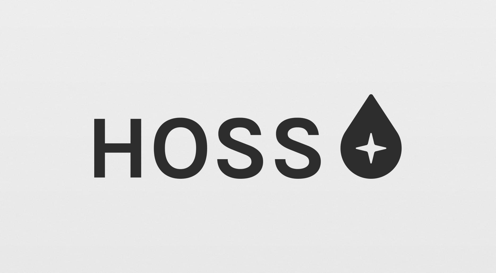
HOSS’s logo is a droplet motif that commonly signifies health, with a negative space rounded plus sign that doubles as a sparkle (that you would see when something is squeaky clean, or hygienic).
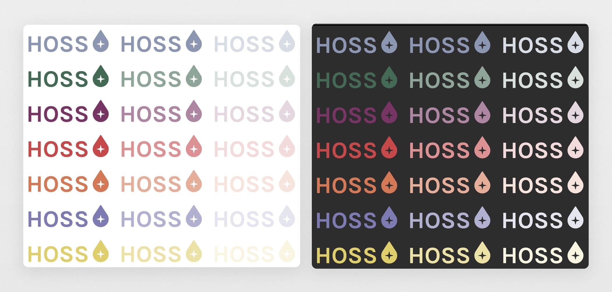
Flexible Colorways Work With Every Partner
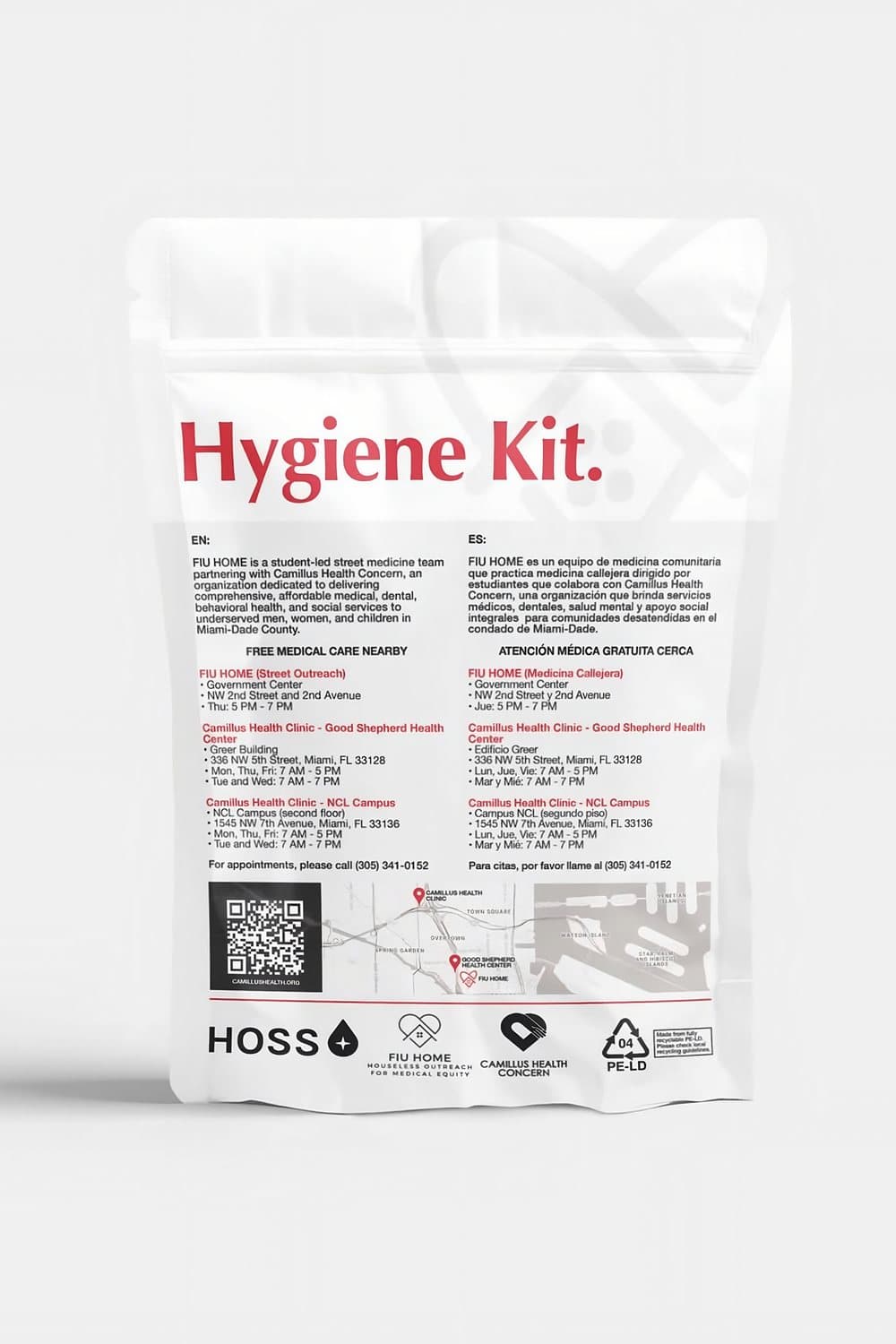
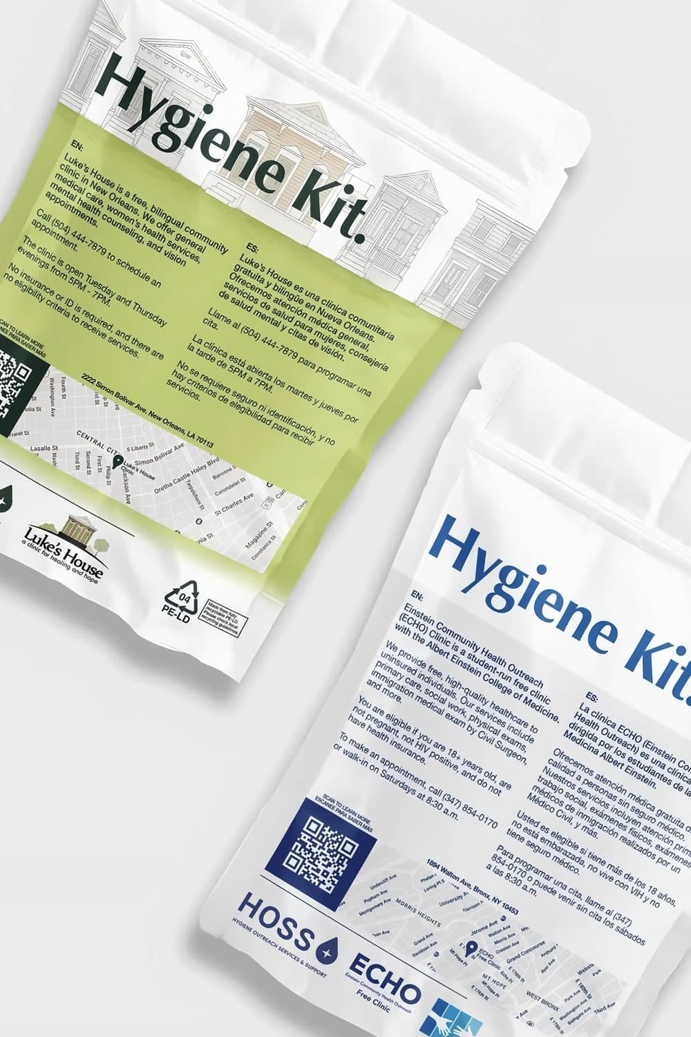
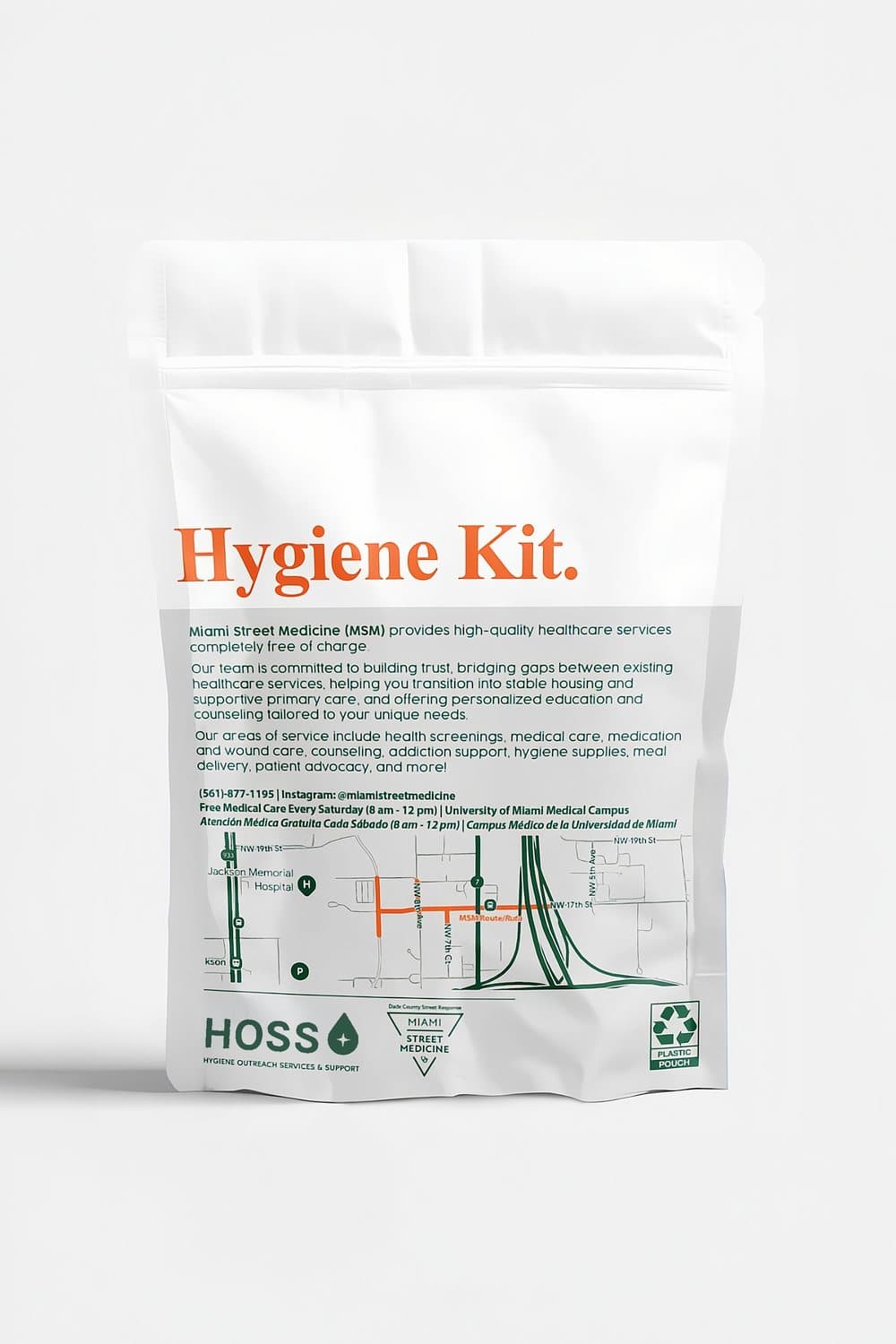
HOSS partners with local hospitals, clinics and institutions to assemble and distribute hygiene kits to underserved populations. The kits are what people actually see, so they have to carry both HOSS’s identity as well as the partner’s identity.
One fixed logo would either fight that color or vanish next to it. So the solution was a system of colors that could integrate with virtually any partner.
What I Learned
I have a lot of fun designing for a nonprofit like HOSS that pumps out thousands of hygiene kits. My favorite part of running a design agency is the range of products and industries you can design for. Knowing not only that my designs make it out to the real world, but also support a good cause, is one of the core reasons I was drawn to design in the first place.