

McLetchie, Bradley & Fowler
TL;DR
A civil-litigation defense firm rebranding after a change in partners. The client arrived with a list of everything she hated and nothing she wanted. My job was prying to uncover their real preferences.
2026
Project Type
White-label subcontract under a legal-web agency.
Role
Brand designer and design lead.
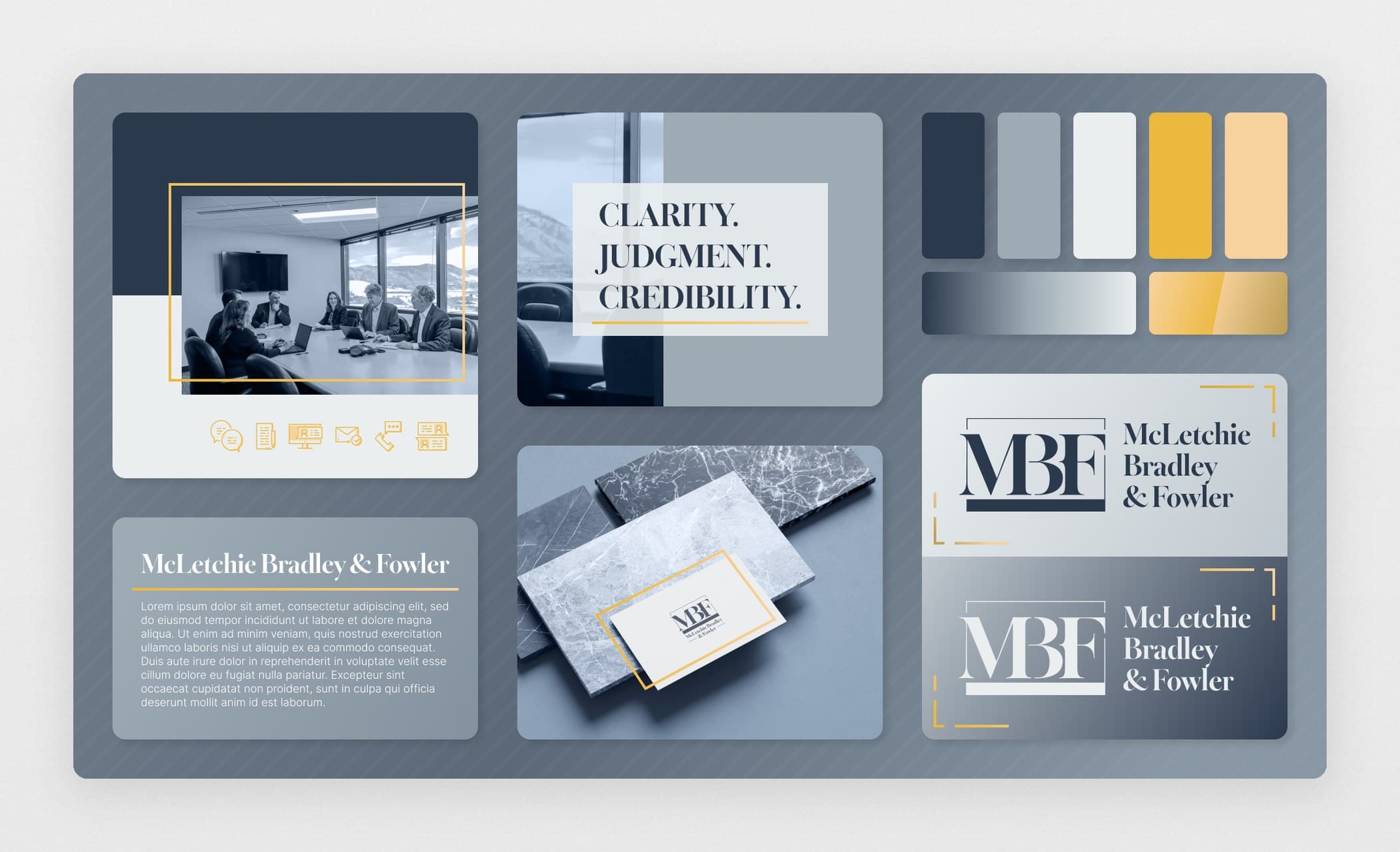
Every Legal Signifier Was Out
A change in partners gave the law firm a new name, and it arrived with no brand behind it. Rachel Bradley, partner, could name the branding concepts she hated and nothing she wanted:
Gavel bullet icons.
Lady Justice stock art.
Pillars of justice.
So the brand had to read as a law firm without using a single thing that clearly says law firm. Whatever it communicated, it had to communicate subliminally.
Moodboarding Against the Gut
Presenting finished concepts to a client who cannot name what she wants is a coin flip. So I built a mood board live with her instead.
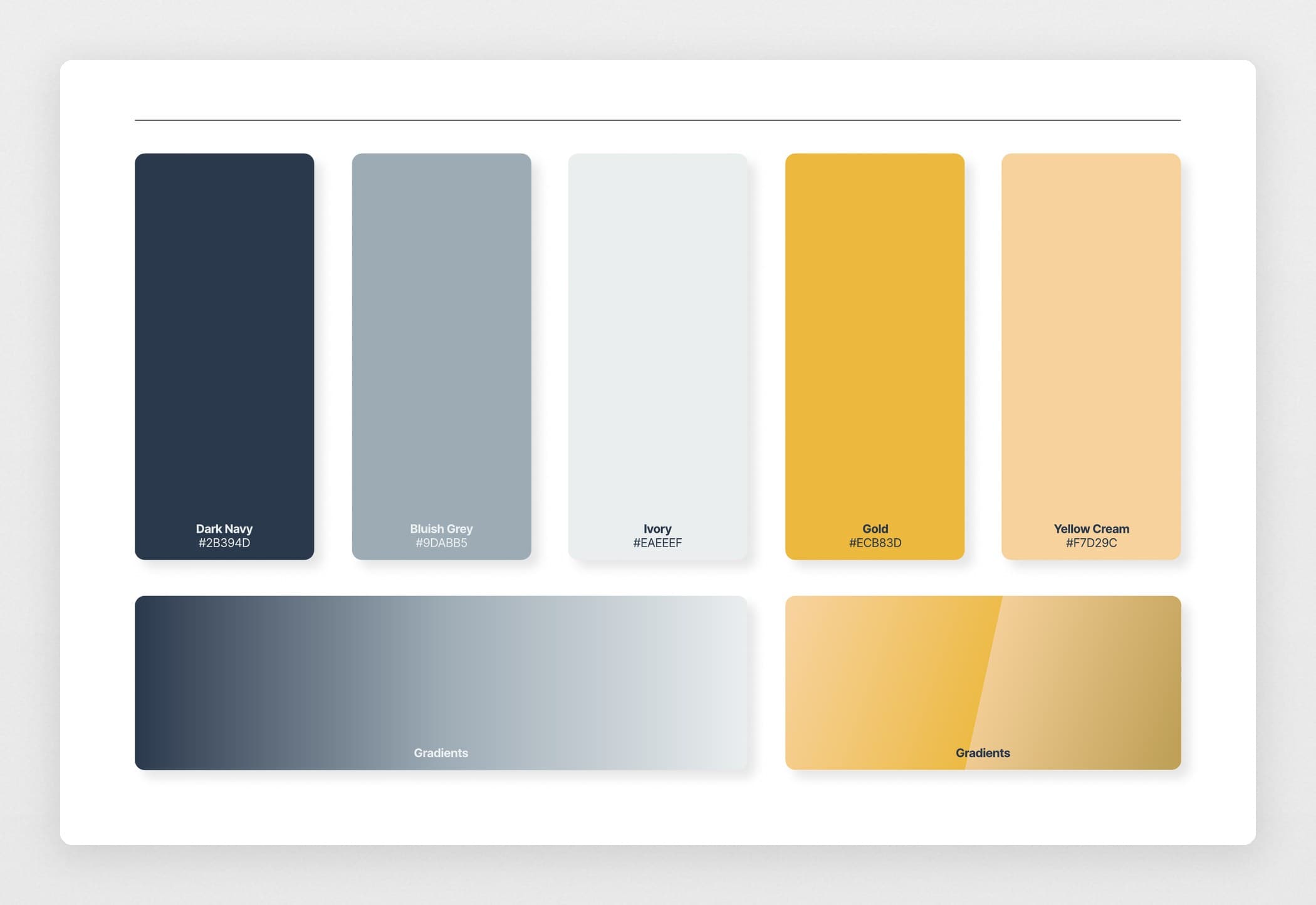
At first, it was narrowing down to maybes (perhaps yes, probably not). A second pass evolved into refusing to let “I like that” or “I hate that” stand as an answer and pushing until she could say what a reference made her feel and why. Once she was describing instead of rejecting, I could name what it had to feel like: “It’s like a navy suit. Classic but not harsh. Professional, put together. Not offensive to anyone.” That became the foundation for the brand.
Why Not a Mountain
The partners were initially drawn to a thin-line mountain mark, a nod to the Golden, CO foothills. A motif chosen because the firm is in Colorado says nothing about the firm. A mountain over a plain typeface could be a Colorado bank, for all I know.
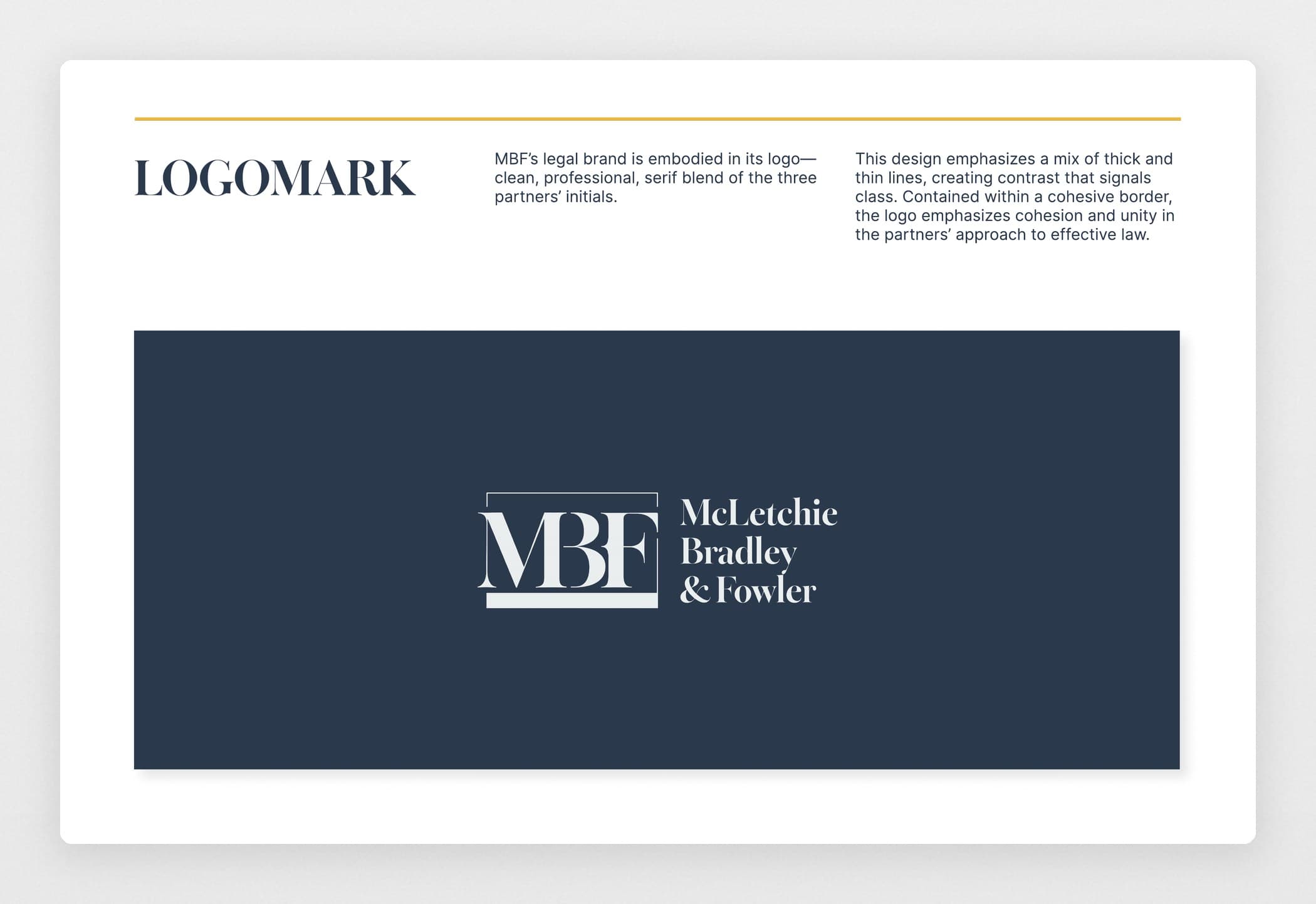
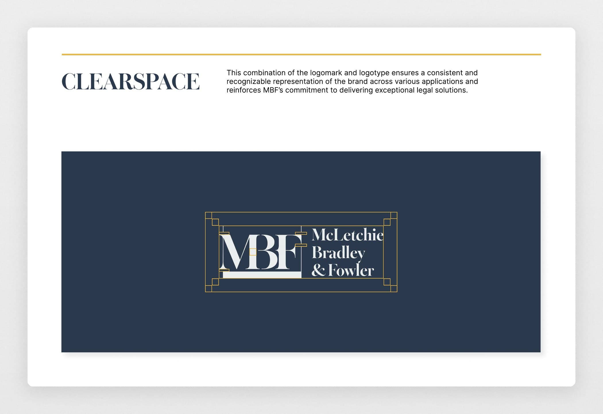
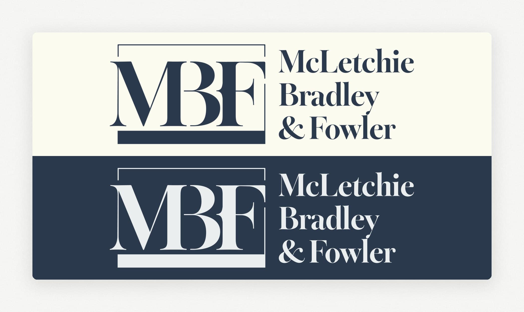
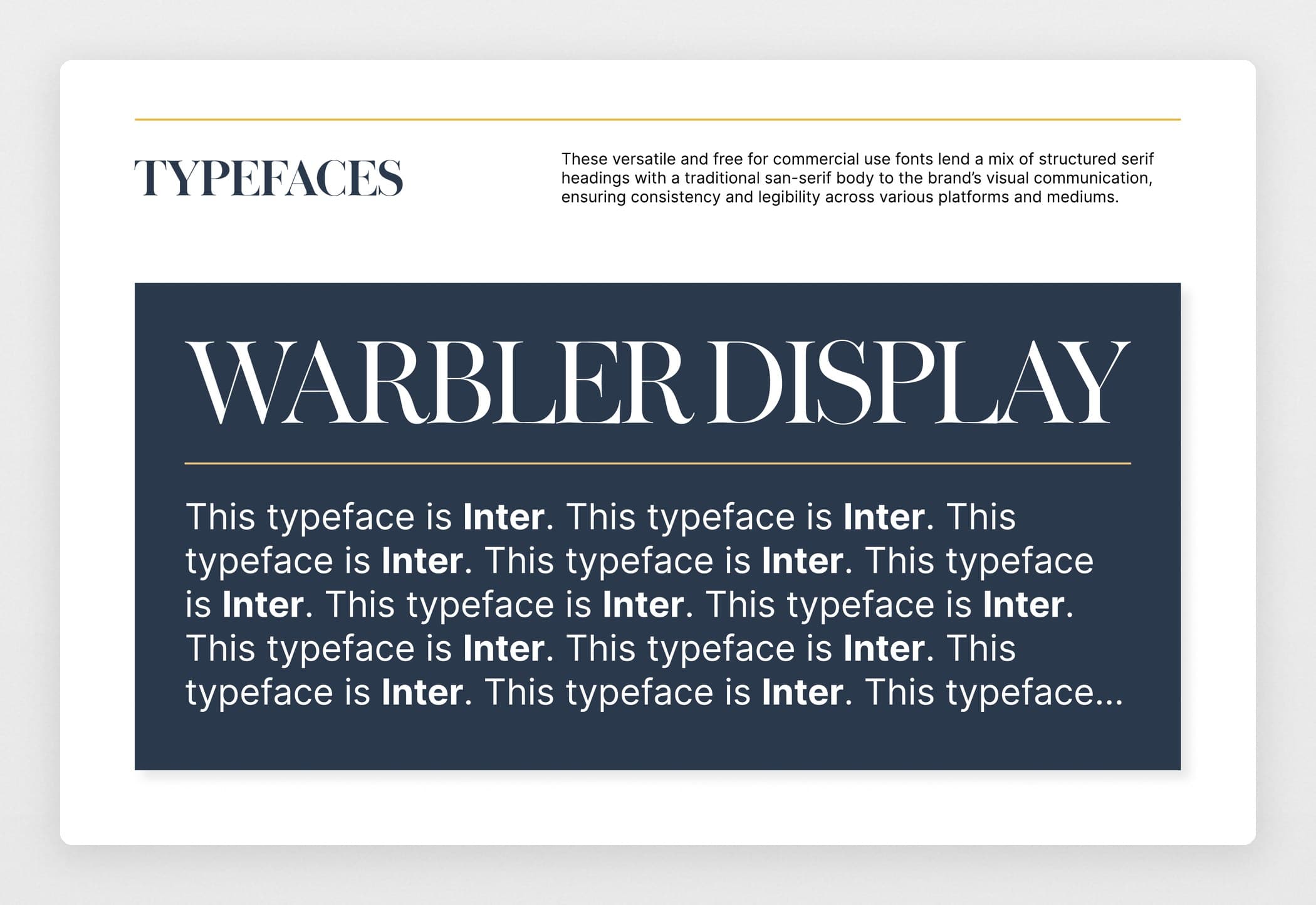
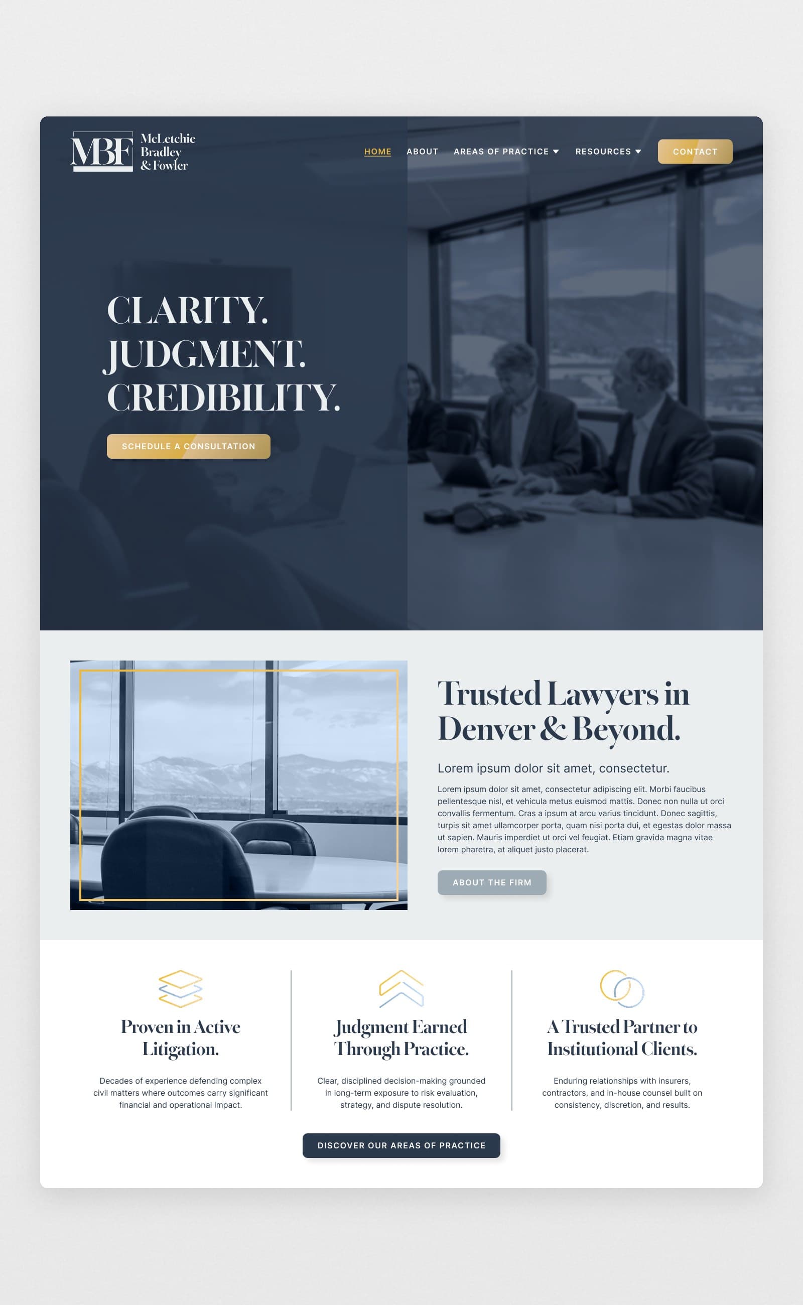
With legal, decorative iconography ruled out by the client, everything had to come from how it carried itself. So the mark does that: the three partners’ initials interlocked, cut in a high-contrast serif, set in the navy. It felt classy, Rachel could envision it on marketing collateral, and it carried the same value any iconized logo would’ve tried to manufacture.

What I Learned
A list of no’s becomes a list of maybes once the client explains them. Rachel arrived certain about what she hated and unable to say why, and every one of those rejections was hiding a reason she had never been asked for.
Getting to those reasons is the entire job. It is what turned a wall of no into a direction, and it is why the partners landed on a lettermark they could picture on everything they put their name to.