
Brand Identity & Logo Design
Logos, color and type, and the rules that hold them together, from a brand designer who also builds the website. For businesses whose work is better than their brand.
Starting From What You Cannot Name
Most clients cannot say what they want from a brand. They can say what they hate. That is a fine place to start.
At McLetchie, Bradley & Fowler, the partner arrived with a list of rejections. No gavels, no Lady Justice, no pillars. So I built a mood board live with her and pushed until she could say why. That became the brand: a navy suit, classic but not harsh.
Built to Hold Up Everywhere
A visual identity that only works in the header is not finished. Every identity ships with lockups for the header, footer, favicon and social, plus rules for color, type and spacing.
Some brands need more room than that. HOSS puts its hygiene kits in front of partner clinics that already have identities of their own. So the deliverable was a color system that sits next to any partner without fighting it.
Colors are checked for contrast before they ship. On Techromatic and Techrobotic, every text-on-background pair was mapped at WCAG AA and AAA.
Brand and Website Together
If you just need the identity defined, that works too, and it is yours to take anywhere. But most of my identities go straight into a site I build. So the brand gets decided where it will actually live, instead of in a PDF that a developer interprets later. As the person who drew it, I can show you how it carries into the website, social posts and the rest of the places it has to work.
The Burt Foundation needed a site before it had a logo, because the board was running a community logo contest. So we designed a modular visual style that could take any mark, and the board chose its palette from eleven.
What a Brand Identity Package Includes
Identities I Designed
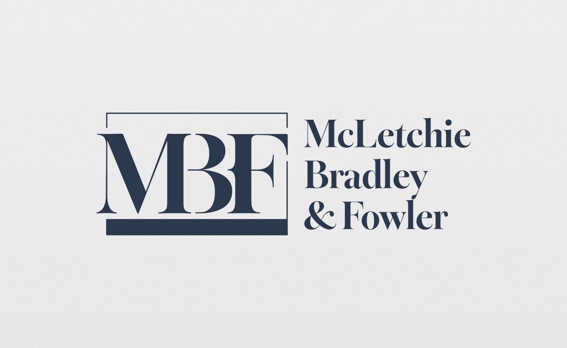
McLetchie, Bradley & Fowler
2026
Brand IdentityBrand IdentityLegalLegalWhite-LabelWhite-LabelA law firm that could name everything it hated and nothing it wanted. The partners landed on an interlocked serif lettermark.
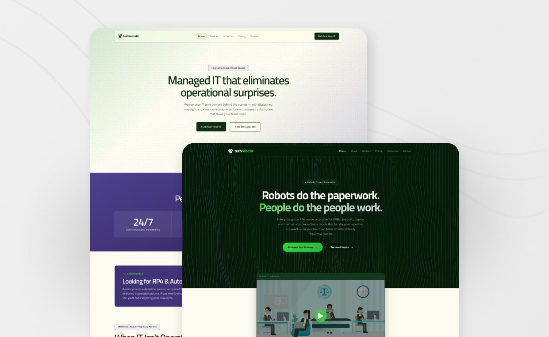
Techromatic & Techrobotic
2026
Websites & BrandWebsites & BrandManaged ITManaged ITWordPressWordPressTwo sibling brands from one company, kept visibly related so the new one could borrow sixteen years of reputation.
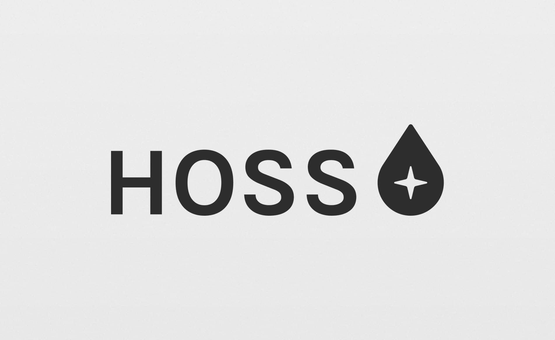
HOSS
2025
Brand IdentityBrand IdentityNonprofitNonprofitColorway SystemColorway SystemA nonprofit’s mark with a color system that co-brands with any partner clinic.
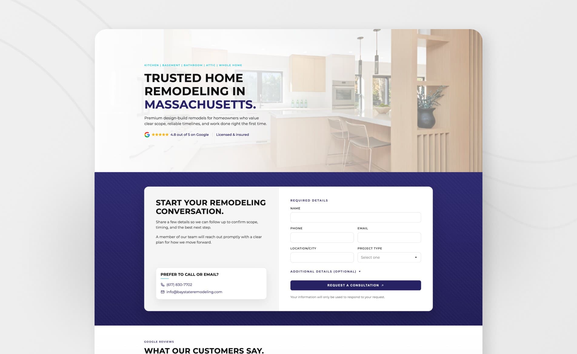
Bay State Holdings
2026
Brand SystemBrand SystemHome ServicesHome ServicesWordPressWordPressOne brand system across three home-services companies whose work was premium and whose sites looked like templates.
“I worked with Jacob on my 2 branding and www projects this year, and the experience was extraordinary! Jacob took on most of the heavy lifting, and freed me up from the shackles of having to do it all myself.”
Questions People Ask
Explore Services
Is your brand behind your work?