

Techromatic & Techrobotic
TL;DR
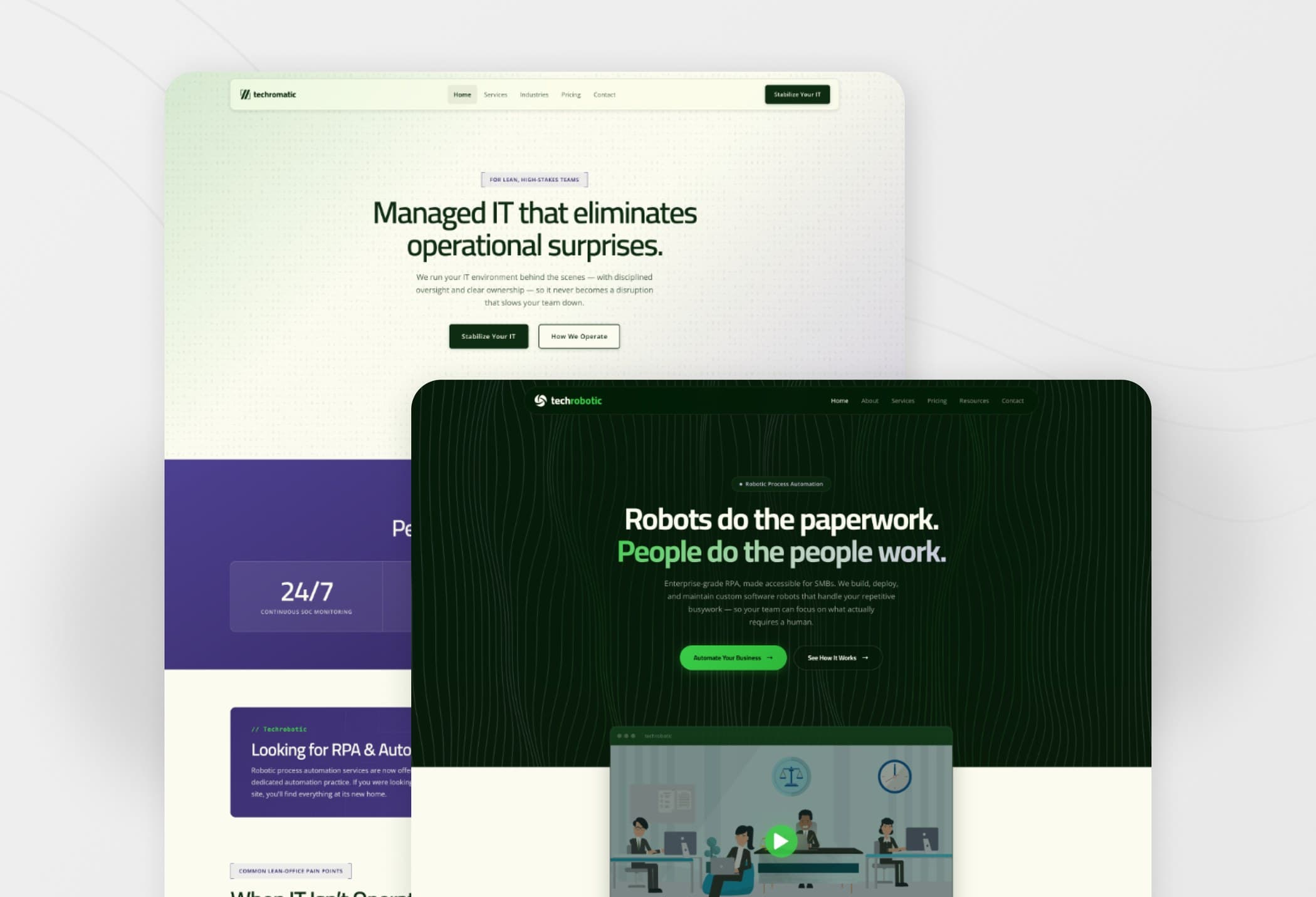
A managed IT company operating since 2010 had bolted an automation practice onto itself, and one website was selling both. IT buyers could not tell it was an IT company. Automation buyers could not tell it was an automation company. I split it into two brands, then designed and built both.
2026
Project Type
Freelance client.
Role
Lead designer and developer, reporting to the founder.
The Challenge
The CEO decided that robotic process automation (RPA), a service offered under his IT company Techromatic, deserves its own company, Techrobotic. I was contracted to find out what each company was without the offerings of the other, and build out the brands.
Three stakeholder interviews decided the positioning:
The IT sales lead opened with “we understand risk and compliance.” That is table stakes. Prying produced actionable differentiators: operating discipline, named ownership, audit-readiness.
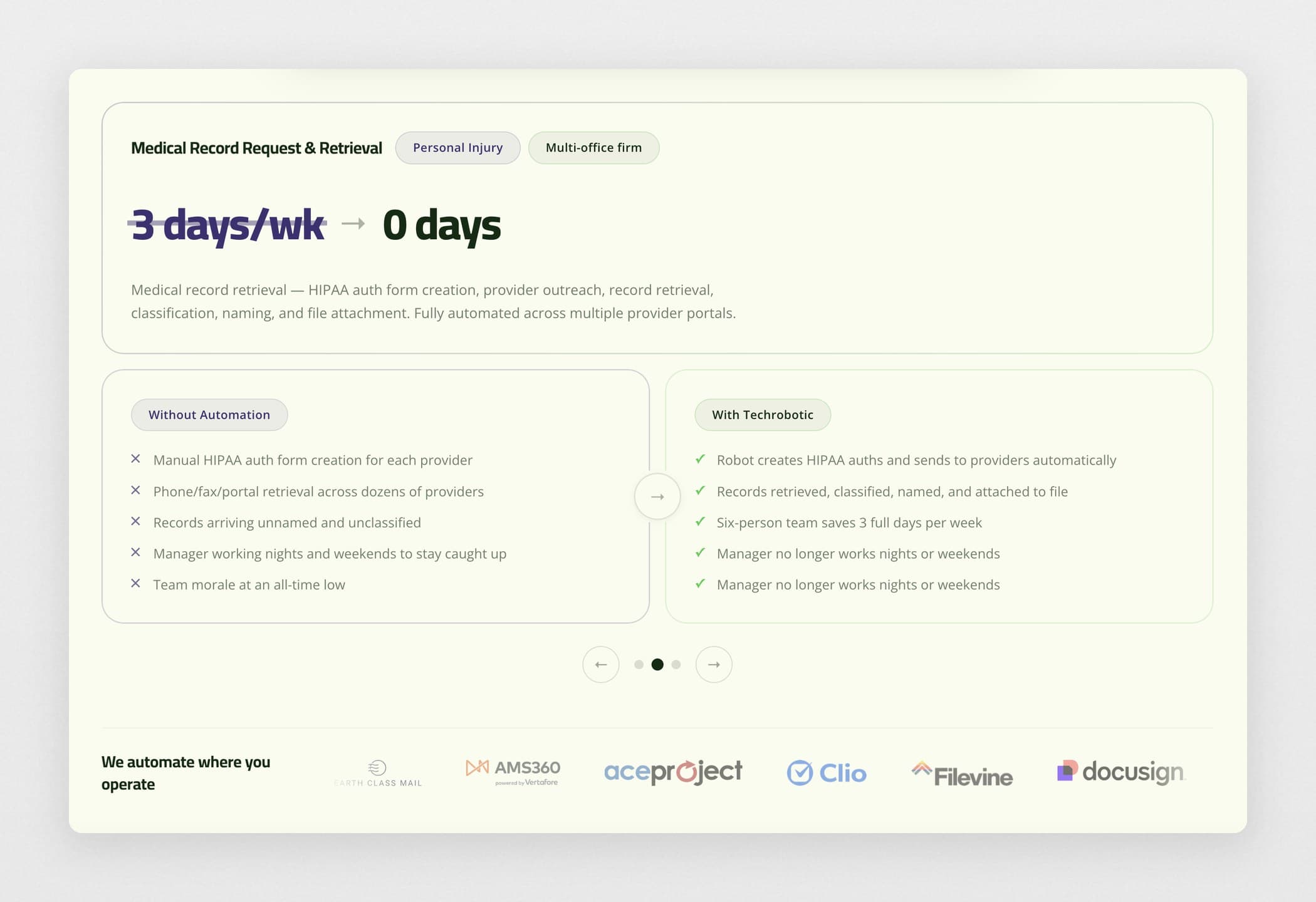
The automation director demoed a probate intake: four hours down to eight minutes. At another firm, a records manager put in writing that Techrobotic’s bot gives her six-person team three days a week back, and ended the late nights and weekends at work.
Two Modes, One Family
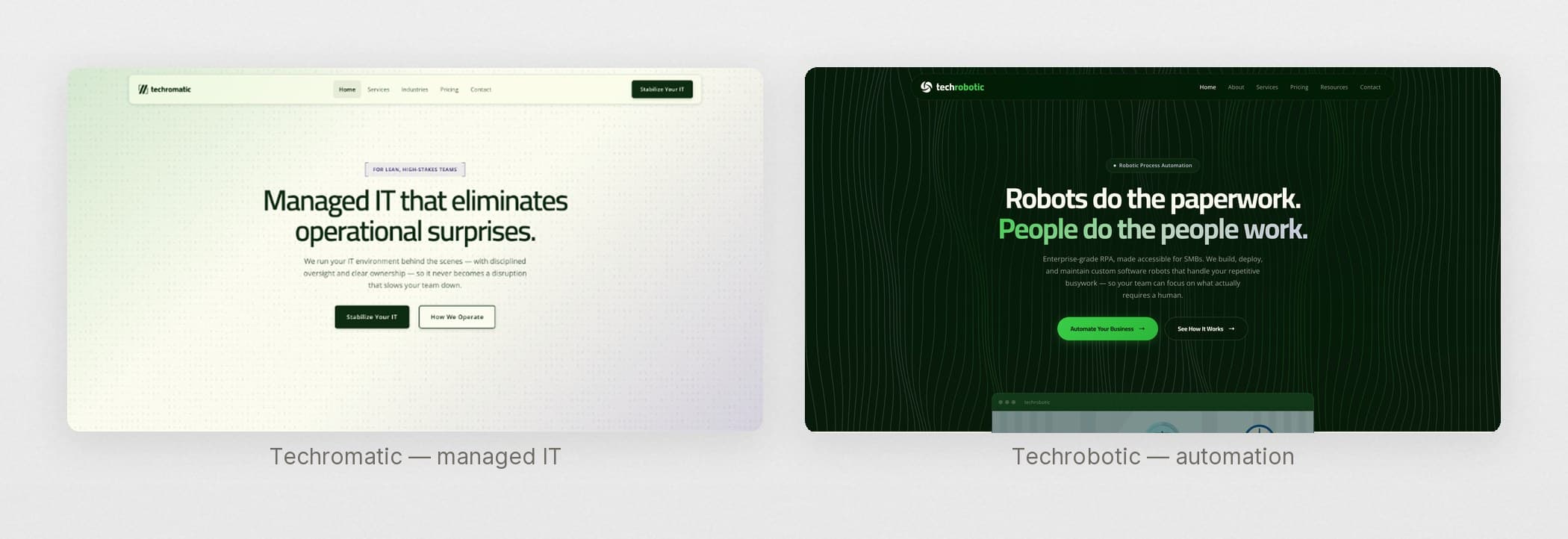
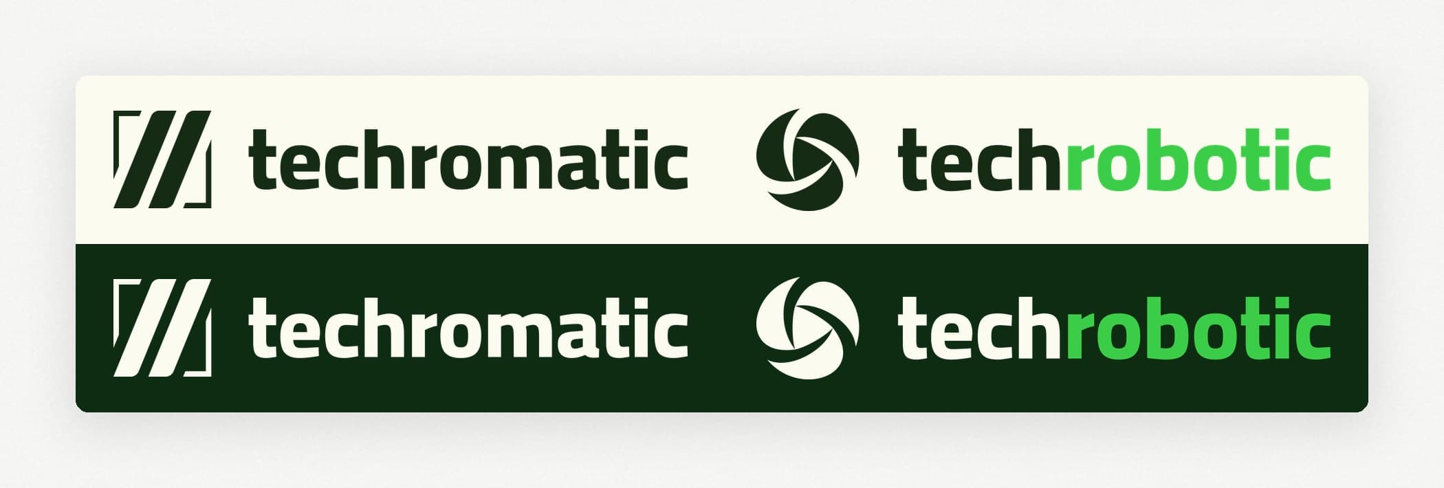
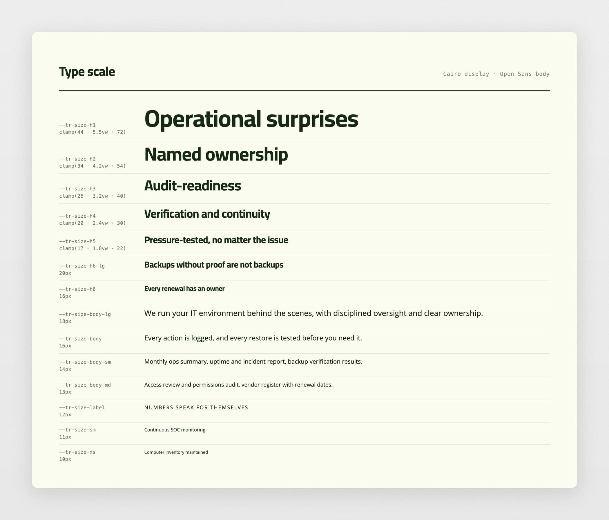
The two had to stay visibly related, because sixteen years of Techromatic’s reputation is the only thing the brand-new automation company could borrow. They also had to be reminiscent of the previous branding to leverage customer familiarity. So I preserved the typography and colors, but gave it a facelift.
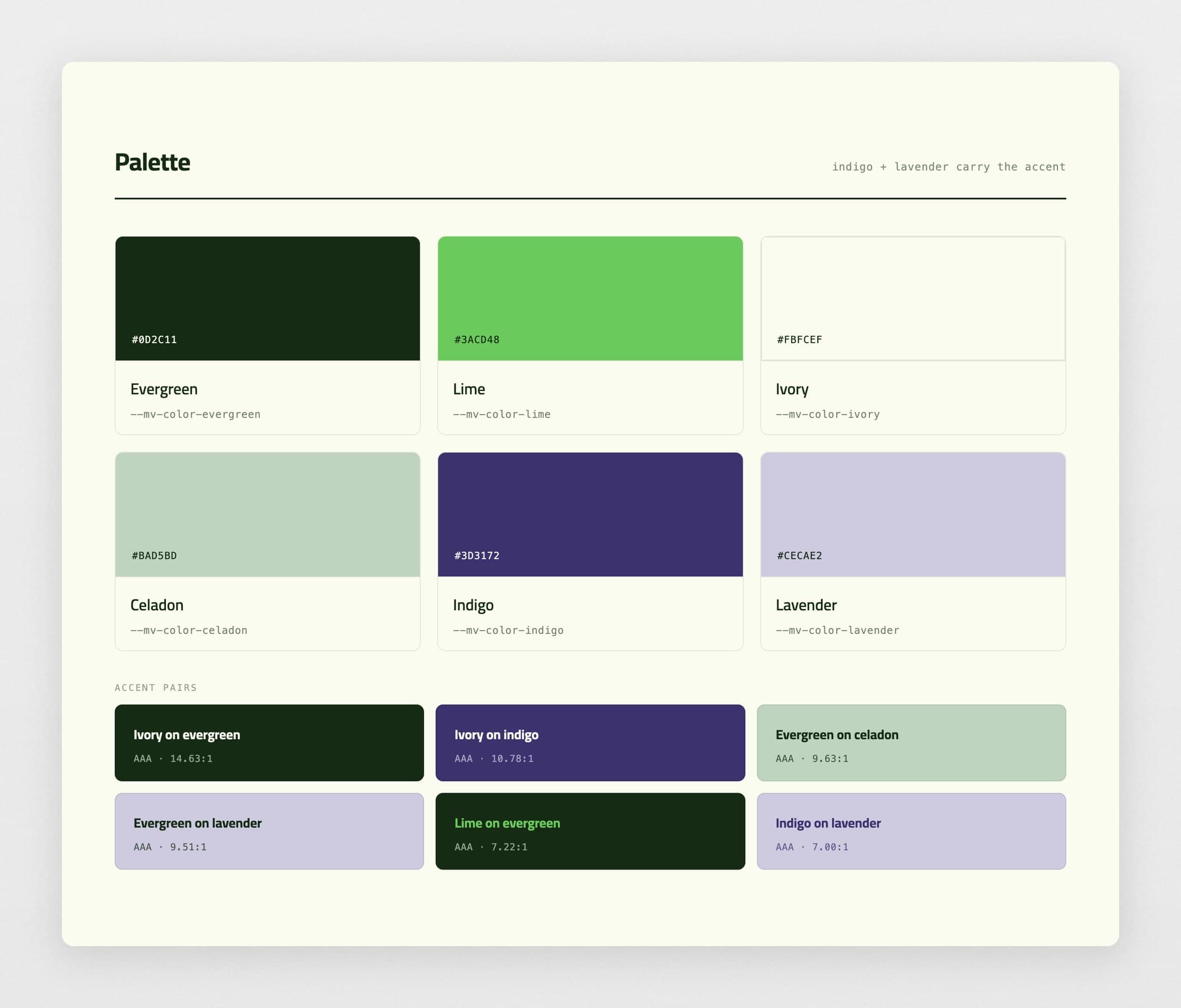
The palette is built out from the evergreen and lime colors they already owned. Every text-on-ground pair was mapped at AA and AAA compliance. Techromatic was given a light-mode colorway to not undermine its heritage, and Techrobotic was given a dark-mode colorway to communicate being the “new kid on the block.”
Both colorways were then encoded into a sandbox of 200+ reusable components, each carrying the identity already applied. It worked as a pseudo-design system: the brand decisions were made once, in the components, and both sites inherited them instead of being re-decided page by page.
Techromatic: Selling to Someone Already Frustrated
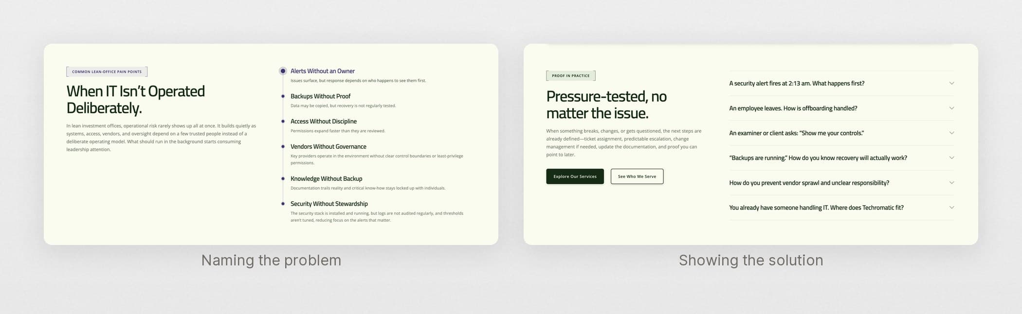
Onboarding uncovered that most people arrive at the IT site already frustrated with their current provider. So instead of shopping features, they are checking whether anyone understands those pain points.
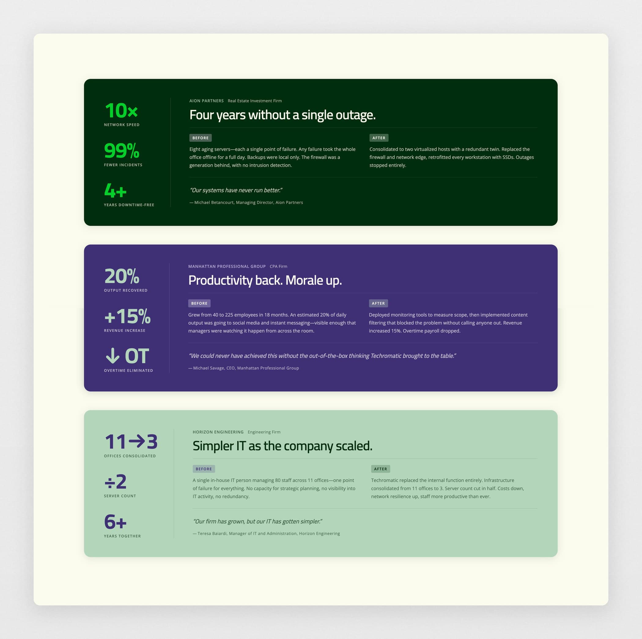
That set the conversion mechanism: name the problem precisely, then show a history of solving it. The homepage runs that sequence, and the case studies carry the proof. It is also why the site has no About section: a buyer still deciding whether you understand their problem does not want your company history.
Positioning followed: IT handled in the backend so it never becomes front of mind.
Motion That Earns Its Place
The interface language is largely technical because syntax signaled IT proficiency. The site built upon this identity with interactive elements: interactive ASCII, symbolic tech-y animated illustrations, and a terminal running dummy code, to name a few.
Techrobotic: Refusing the AI Framing
The founder owned the .ai domain and wanted to lead with AI positioning. This relatively arbitrary conversation, whether the logo should say .ai or not, evolved into a pivotal resolution revealing the future of Techrobotic’s identity as an RPA company vs. an automation company.
Robotic process automation is deterministic: the same steps, the same order, the same result every run. That is why it can be trusted with a filing deadline or a medical record. AI automation is probabilistic, and by 2026 the term carries every agency selling a prompt as a product.
Leading with AI would have erased one of the only things Techrobotic could claim that competitors could not. So determinism became the spine of the positioning. The AI hook moved to outbound, where a buzzword opens a door instead of making a promise.
Proof First
Most Techrobotic buyers have never watched a software robot work, and you cannot sell determinism with an adjective. So the proof runs above the fold, followed by case studies of real results.
Pricing Something You Cannot Price Yet
Automation cost is genuinely unknowable before workflow discovery. And instead of hiding that behind a contact form, the site had to earn trust through pricing transparency.
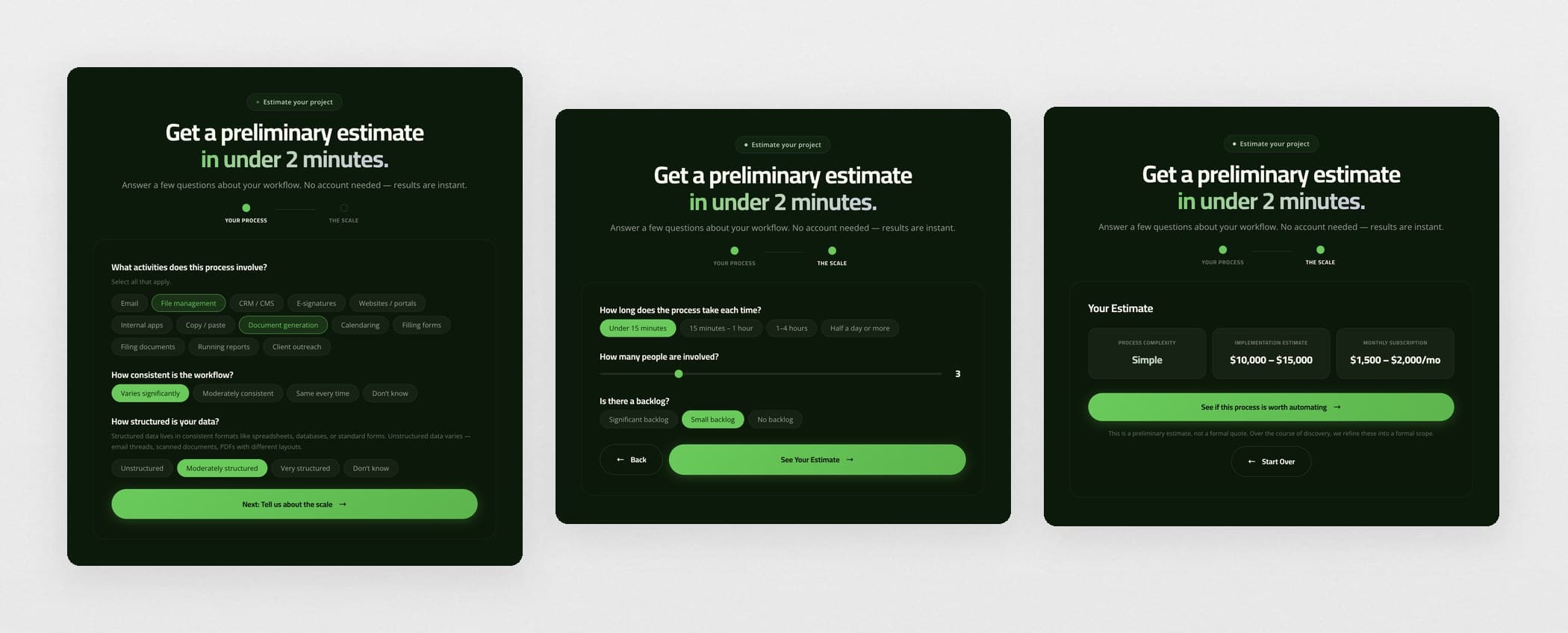
I built a pricing module with a built-in calculator that roughly estimates bot cost from workflow complexity and consistency. The automation director wanted fifteen questions, but I cut it to six, because an estimator nobody finishes gives the visitor no information at all.
Building Both
Both sites are custom themes, built with Claude Code on local WordPress instances and pushed to production on WP Engine.
The component sandbox came first, so building each page was assembly rather than fresh decisions.
GSAP for scroll behavior: stacking cards, accordions, horizontal rows.
Custom CRM forms instead of the Zoho plugin. Each input is hardwired to its CRM field ID, so submissions land in the founder’s CRM and the form still looks like the site.
Both launched at 98 Lighthouse performance and 94–97 accessibility. In the four months after launch, organic search brought 1,126 new users to Techromatic, roughly 44% of all new users. The Techrobotic site has converted multiple SMB leads into paying customers.
Collateral and Tooling
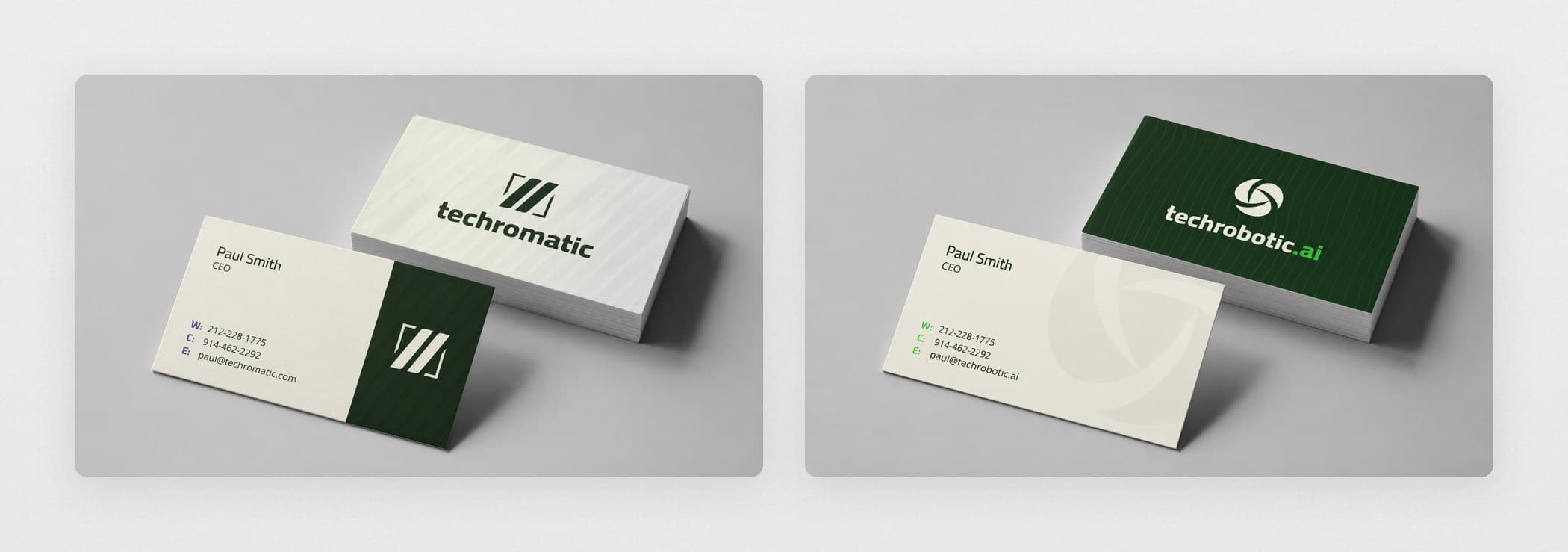
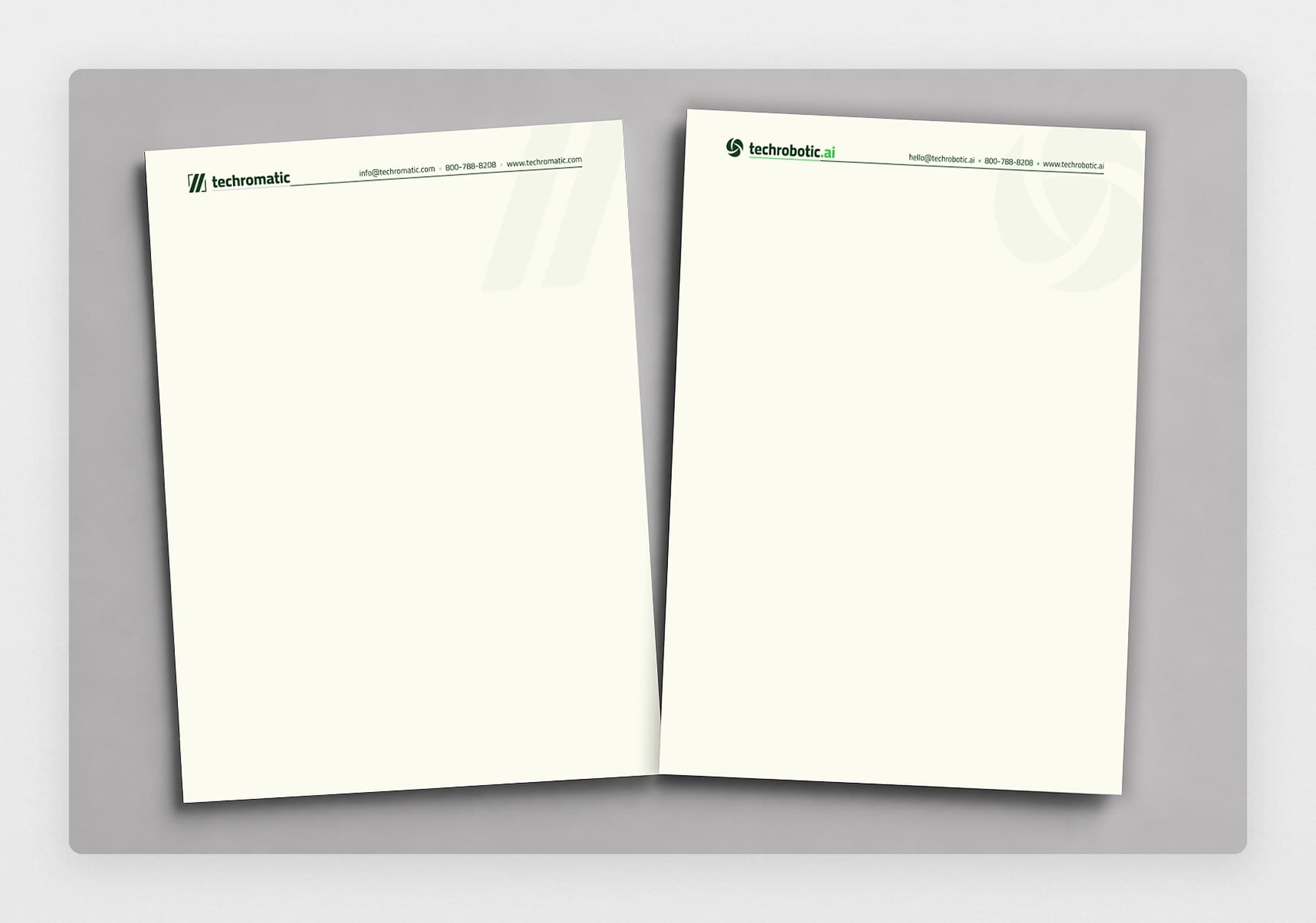
Cards, letterhead, email signatures for the team, one-pagers, and profile setup for both companies.
A Deck Generator Instead of Master Slides
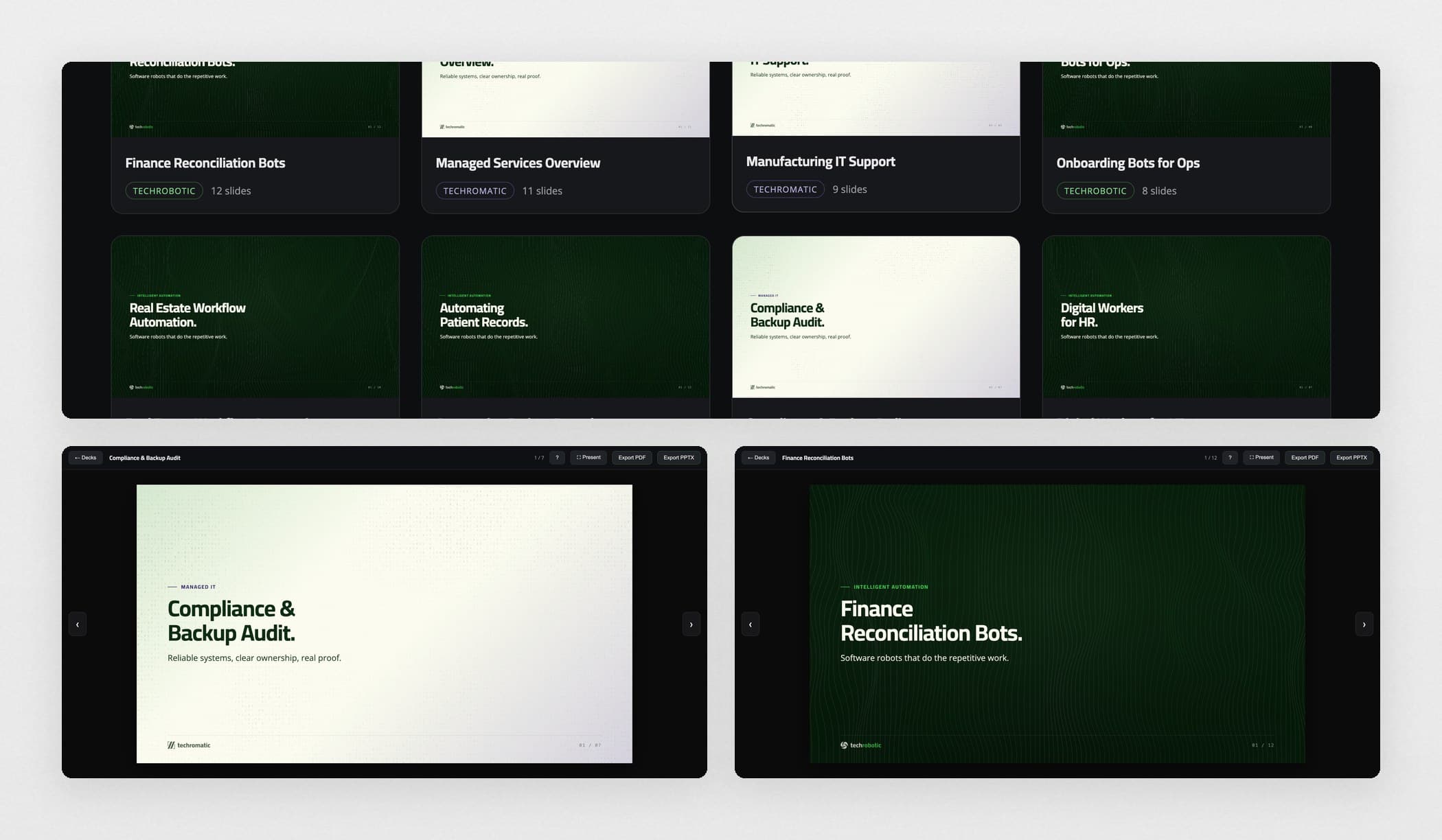
Master slides go stale the moment someone drags a text box. Instead I built a rendering engine that encodes both brands’ design logic in code: prebuilt layouts, procedural backgrounds, export to PDF or PPTX. The founder writes a prompt and gets an on-brand deck.
Then I installed the tooling on his machine and taught him to run it.
I’ve never had a website that I loved that really was focused. It’s always been a little mishmash, or I’ve been too involved and the designer was taking too much direction from me.
I’m not a branding or marketing person at all. I just can tell you what I like. But when you said maybe that’s an outbound tactic, it clicked. I now totally get it.
Really love everything, the design, the positioning, the micro-animations. It’s really well-done work.
What I Learned
Techromatic: diagnose before you pitch. When the buyer arrives already in pain, credibility comes from naming their problem more precisely than they can, not from describing yourself.
Techrobotic: determinism is the differentiator. In a market selling the buzz of AI, the harder claim was the honest one, and the only one competitors could not copy.
The split: design has to prevent brand confusion. Nobody hands you the division. You keep asking the right questions until the identity split reveals itself.
View the live websites here: techromatic.com and techrobotic.ai