

What Should a Nonprofit Website Include? A Checklist by Audience
A nonprofit website serves four audiences: donors, the people you serve, volunteers and funders. Each one comes with a different question. This checklist covers what each needs, what charity raters check, and what a small staff should build first.
Your Website Is Already Being Checked
Most small nonprofits do not have a web person. The site went up years ago, built by a volunteer or a board member's relative. The staff page lists people who have moved on, and nobody has tried the donate button on a phone in a while.
Meanwhile, the site is being checked. In Give.org's 2026 Donor Trust Report, 59% of people said they usually look for information before they give. Among them, the charity's own website was the top influence, at 54%. Grantmakers often look you up before a first call. And for many of the people you serve, the website is where they first find out whether you can help.
So before any checklist, it helps to know who is looking, and what each of them came to find.
The Short Answer
- A nonprofit website serves four audiences. Donors, the people you serve, volunteers and funders each come with a different question. A site built only for donors fails the other three.
- Every nonprofit website should include a one-sentence mission, your programs, proof of impact, a donate page, ways to get involved, contact details, and a Financials page with your Form 990 and annual report.
- Funders and careful donors check the details. Your address, your EIN, your board, your financials and a privacy policy. The charity evaluators publish exactly what they expect.
- Most visits come from phones, and phones give less. In M+R's 2026 Benchmarks, 52% of nonprofit website visits were on mobile. But only 8% of mobile visitors to the main donation page gave, against 11% on desktop.
- Build only what your staff can keep current. A news page last updated two years ago costs more trust than having no news page at all.
Who a Nonprofit Website Is For
Most checklists assume every visitor is a donor. But each of the four audiences arrives with its own question, and looks for different pages to answer it.
| Audience | Their question | What they need to find |
|---|---|---|
| Donors | Is this organization worth my money? | The mission, results, stories, an easy donate page, financials |
| People you serve | Can you help me, and how do I start? | Services, who qualifies, how to apply, hours, locations, contact |
| Volunteers | How can I help besides money? | Volunteer roles, a sign-up form, events |
| Funders, partners and press | Is this organization well run? | Programs, results, board and staff, Form 990, annual report |
Which audience comes first depends on what the organization does. A foundation or an advocacy group runs on donations, so donors come first. A food bank, a legal clinic or a shelter exists for the people it serves. They come first, and many of them arrive in a hard moment, on a phone.
So the first decision is whose question the homepage answers first.
What Every Nonprofit Website Should Include
What should a nonprofit website include, then? Start with the homepage, since every audience passes through it. Here it is top to bottom, with the audiences each part serves.
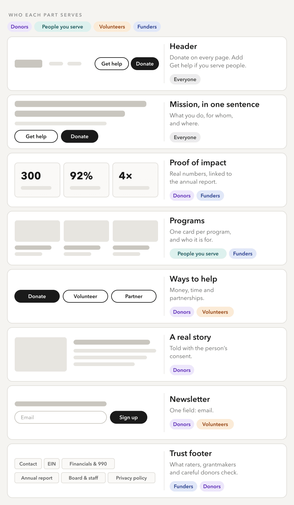
A wireframe, not a template. The order follows the questions visitors bring, starting with what the organization does.
Beyond the homepage, these are the pages every nonprofit needs.
- About. The mission, a short history, and the board and staff by name.
- Programs. A page or section for each program, with who it serves and how to take part.
- Get help, if you serve people directly. Who qualifies, how to apply, hours, locations and what to bring. Write it in plain language, and in the languages your community speaks.
- Donate. One page with a short form. More on it below.
- Get involved. Volunteer roles and a sign-up form, plus events if you hold them.
- Financials. The latest Form 990, audited statements if you have them, and the annual report, in one place.
- Contact. An email address, a phone number, a mailing address, and who answers.
- Privacy policy. What you collect, how you use it, and how someone can opt out.
The Financials page and the footer look like housekeeping. But they are what the most careful readers check first.
What Donors and Funders Check
A grant officer reading twenty applications, or a donor about to give $500, wants proof the organization is well run. Nobody has to guess what that proof looks like, because the charity evaluators publish it.
The BBB Wise Giving Alliance sets 20 Standards for Charity Accountability. Three of them cover what a charity makes public.
- Standard 16 asks for an annual report with the mission, last year's accomplishments, a board roster and basic financials. That means total income, expenses by program, fundraising and administration, and ending net assets. A page on the website counts.
- Standard 17 says any website that asks for donations should carry that same information, plus the charity's mailing address and electronic access to its latest Form 990.
- Standard 18 asks for a clear, prominent privacy policy. It should say what is collected, how to correct it, how to opt out of sharing, and how the information is kept secure.
Charity Navigator checks the website itself only for donor-funded charities with $50 million or more in annual revenue. There, it looks for five things: the Form 990, audited financial statements, key staff, the board, and a donor privacy policy. Those five make a sound minimum at any size. For smaller charities, it works from the Form 990 instead, including whether the return lists a website.
The IRS makes the 990 easy to share. An exempt organization must make its recent returns available to anyone who asks. If it posts them online, it no longer has to send copies on request, though it still has to allow inspection in person.
In practice, a Financials page and a good footer cover almost all of this. None of it is legal or tax advice, and whoever prepares your 990 has the final word on it.
The Donate Page
Once someone decides to give, the donate page has one job: keep them. On phones, it does that job worse. M+R's 2026 Benchmarks show where it slips.
- Nonprofits received donations from 1.6% of all website visitors.
- On the main donation page, 11% of desktop visitors gave, against 8% on mobile. For small nonprofits on mobile, it was 4%.
- Mobile brought 52% of visits. Desktop brought 57% of gifts and 72% of the revenue.
- The average desktop gift was $168, against $88 on mobile.
So most visitors arrive on a phone, and the phone is where gifts get lost. A donate page should do six things.
- Fit a phone without zooming, and load quickly.
- Ask only what the payment needs. Every extra field is a reason to stop.
- Offer the wallets people already use. PayPal was on 79% of nonprofit donation pages, Google Pay on 58% and Apple Pay on 57%.
- Offer monthly giving next to a one-time gift.
- Say what a gift does, in your own real numbers.
- Get tested on a real phone before launch, by someone who did not build it.
Two Worked Examples
Here is what the checklist looks like in practice, for a fictional tutoring nonprofit called Mid-City Readers.
The homepage hero
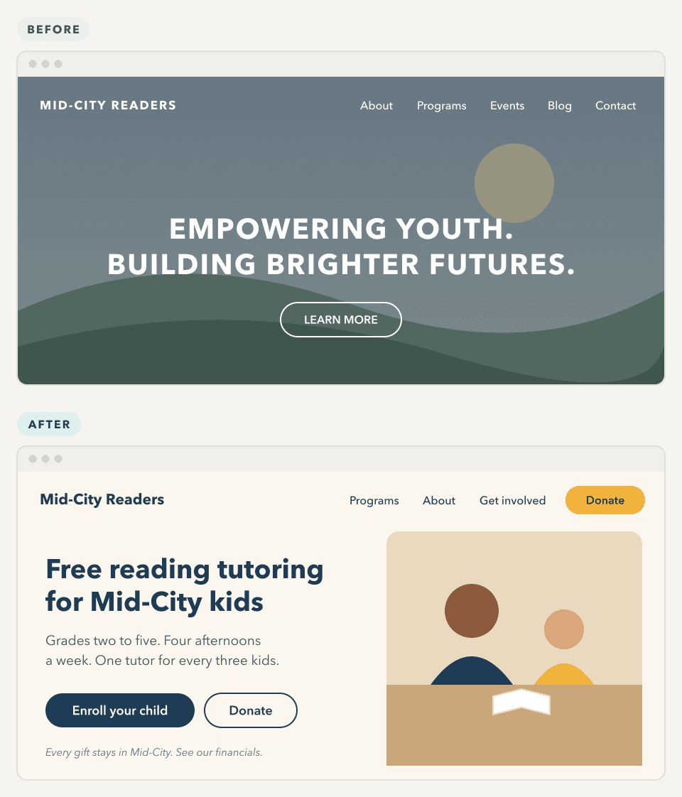
The before is the pattern you see everywhere: a stock photo, a tagline that could belong to any organization, and one button that says "Learn more". A parent cannot tell whether the program is for their child. A donor cannot tell what a gift pays for. And there is no way to give from the menu.
The after makes five choices, and each one answers somebody.
- The headline says what and for whom in six words.
- The line under it answers a parent's next questions: which grades, when, and how many kids per tutor.
- Two buttons for two audiences. Enroll comes first, because the families are who the program exists for. Donate sits beside it.
- Donate is in the menu, so it is one tap away on every page.
- The photo is the program itself, a tutor and a child, used with consent. A quiet line under the buttons points donors to the financials.
The footer
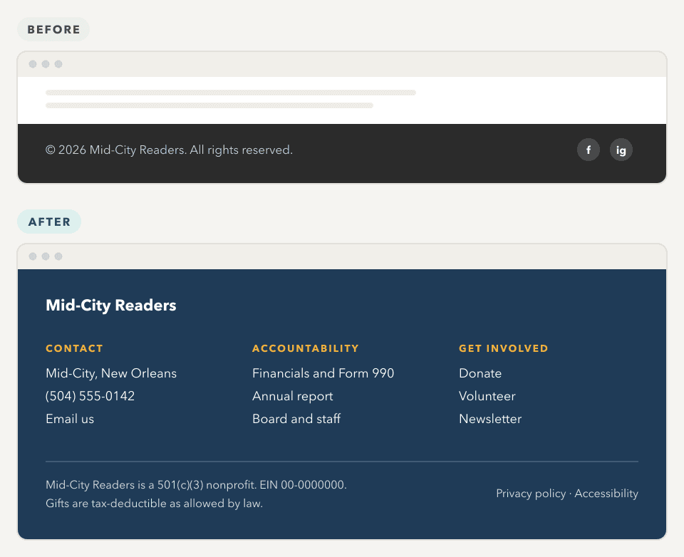
The before tells a funder nothing, and gives a careful donor nothing to check.
The after does the work of a trust page in three short columns. Contact says how to reach a person. Accountability links to the Financials page, the annual report and the board, which covers the website side of BBB's Standard 17. And the closing line states the 501(c)(3) status and the EIN, so a grantmaker can look the organization up in the IRS's Tax Exempt Organization Search before the first call. Charity Navigator's own footer lists its EIN the same way.
What to Build First
A small staff cannot build everything at once, and does not need to. Launch with what every audience needs, then add the rest as someone takes it on.
| Launch with | Add next | Add once someone owns it |
|---|---|---|
| A homepage that leads with the mission line | Volunteer page and sign-up | A news section or blog |
| Programs, and Get help if you serve people | Events | A series of stories |
| A donate page that works on a phone | Newsletter sign-up | A resource library |
| About, with board and staff | An impact page | |
| Contact, Financials, the footer and a privacy policy |
One exception: if many of the people you serve speak another language, translate the Get help page at launch, not later.
How to Build a Nonprofit Website
The steps to make a charity website are the same at any budget.
- Decide whose question the homepage answers first. Donors, or the people you serve.
- Gather the content before the design. That means the mission line, programs, three impact numbers, the board and staff list, the latest 990 and annual report, and photos you have permission to use.
- Choose a platform your staff can edit. A builder like Wix or Squarespace suits a small site with a few pages. WordPress suits a site with many programs and events and several people editing it. How the three compare.
- Set up donations through a payment processor or donation platform, and test them on a phone.
- Write each page for its audience, in plain language.
- Check the basics of accessibility. Text with enough contrast, alt text on images, headings in order, and forms that work with a keyboard.
- Launch and get found. Verify the site in Google Search Console, submit the sitemap, and add the address to your Google Business Profile, your Candid profile and your next Form 990.
- Give every page an owner, as in the next section.
Keep It Current
Nonprofit websites usually go wrong slowly. Two years after launch, the events page still lists a past gala, and the staff page shows people who have left. To a donor doing research, a stale site reads as a stale organization.
So give every page an owner and a rhythm.
| Page | Who owns it | How often |
|---|---|---|
| Homepage impact numbers | Executive director | Once a year, with the annual report |
| Programs and Get help | Program staff | Whenever eligibility, hours or locations change |
| Events | Whoever runs the event | Before and after each one |
| Board and staff | Operations or office lead | Whenever someone joins or leaves |
| Financials | Finance lead | Every year, once the 990 is filed |
| News or blog | Communications | Only if someone can commit to a schedule |
If a page has no owner, leave it out. Six current pages beat twenty stale ones.
When to Bring In Help
Plenty of small nonprofits run a good site on a builder, with no outside help. That works when the site has a handful of pages, one person keeps it current, and donations run through a donation platform.
It is time to bring in a designer when:
- The site has to serve two audiences at once, like donors and families seeking help, and neither path is clear.
- Staff edits keep breaking the layout, so nobody wants to touch the site.
- You need what a template does poorly, like a Get help path in two languages, an events calendar, or an application or grant portal.
- The site is part of how you raise money, and the donate page is losing people.
Whoever you hire, ask four questions.
- Can our staff edit words and images without breaking the layout?
- Will we own the site, the domain and every file?
- How will the donate page work on a phone, and when do we test it?
- After launch, who handles updates, backups and security?
Where to go from here
If your organization needs a site that serves donors and the people you serve, and that your staff can keep current without a web person, that is the kind of site I build. See how I work with nonprofits, or tell me about your organization.
Questions People Ask
The Services Behind This
Nonprofits
Websites, brands and grant portals for small nonprofits, charities and family foundations. One designer does the whole job, and builds it so the staff you have can run it.
Website Design
Custom-built, not templated. Websites for small and mid-size businesses and nonprofits, designed and built by the same person.
Keep Reading
Need a site your staff can keep current?