

Best Restaurant Websites: 9 Examples and What They Get Right
The best restaurant websites do two jobs on a phone. They answer the first questions fast, like whether it is open, where it is and how to get a table. And they look and feel like the restaurant, so the site sells the night before the guest arrives.
Guests Hear About You Before They Visit Your Site
A restaurant website rarely introduces anyone to a restaurant. In a 2025 Toast survey of 1,466 US adults, word of mouth was the top way people found a new restaurant, at 38%. Walking or driving past came next, at 30%.
The website comes later. Someone has heard about you, or seen your sign, and now they are checking. Can we go tonight? Do we need a booking? What does it cost? In a Nielsen survey for Reputation in 2025, Google Search was the top place people looked, at 56%. Nearly 40% looked at a menu online before visiting. BrightLocal's 2026 survey found that after reading good reviews, 54% of people go on to check the business's website.
So the best restaurant websites do two jobs in the minute someone is choosing where to eat. They answer the practical questions fast. And they give a first taste of the night. The type, the colors and the photos tell a guest what the room will feel like before they read a word. That first impression is part of the sale. This guide shows nine sites that do both, each on a phone, and what each one gets right.
The Short Answer
- Answer the first questions in the first screen. Is it open, what kind of place is it, where is it, and how do you get a table.
- Keep menus, hours and the address as text. Not only a PDF or a photo, so phones, screen readers and Google can read them.
- Put call, map and reserve under the thumb. One tap from anywhere on the page.
- Make the site look and feel like the restaurant. The same type, colors and photography as the room, so the site previews the night at the moment of decision.
- Show the room, and say what you are in one line. Plates alone do not tell a guest what the night will feel like.
- Keep it current. Your website is the source your Google listing and your regulars trust.
What Guests Come to a Restaurant Website For
Every choice on a restaurant site should answer a question a guest actually has. Most of the questions are practical. One is a feeling, what will this be like, and the look of the site answers it before any text does.
| The guest's question | What answers it |
|---|---|
| Can we go tonight? | Today's hours, and whether you take walk-ins |
| What kind of place is it? | One line on the food and the neighborhood |
| What is it like? | The restaurant's own look, and photos of the room during service |
| Where exactly? | The address, a cross street, parking, a map link |
| How do we get a table? | A reserve button that opens the booking screen |
| What does it cost? | A menu with prices, as text |
Regulars use the site too. In DoorDash's 2026 survey of 3,001 US consumers, 80% of dine-in visits were to restaurants the guest had tried before. Those guests are not browsing. They want tonight's hours, the brunch menu or the phone number, fast.
Why the Look of the Site Matters
A guest cannot taste the food from a phone. What they can see is how the place presents itself, and they read that as a preview of the night. A site in the restaurant's own type and colors, with photos taken in its own light, tells them what kind of evening it will be. A generic template tells them nothing, even when every fact on it is right.
Photography carries much of that weight. In a 2022 Ohio State study, food photos with richer color saturation looked fresher and tastier to viewers, and made them more willing to order. That is one study of one effect. But it points the same way as the craft. What a guest sees shapes what they expect to enjoy.
So the look and the answers work as a pair. The look makes someone want to go, and the answers make it easy to say yes. A beautiful site that hides the hours loses guests at the last step. So every example below was chosen for one practical move, and each one makes that move in its own brand.
The Best Restaurant Websites, and What Each Gets Right
The best restaurant website design is easier to see than to describe. These restaurant website examples were chosen for one move each, and every screenshot is the site on a phone in November 2026. They are independent restaurants, not chains, so the moves are ones any owner can copy. None of them is a client of mine, and sites change, so look at each one live before you borrow from it.
Pêche and Turkey and the Wolf: say how seating works before anyone asks
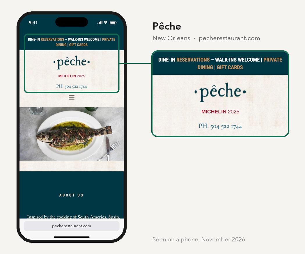
One of the first things a guest wants to know is whether they need a booking. Pêche, in New Orleans, answers it in the first line of its site, which reads "Dine-in reservations, walk-ins welcome." The phone number sits right under the name, and tapping it starts a call.
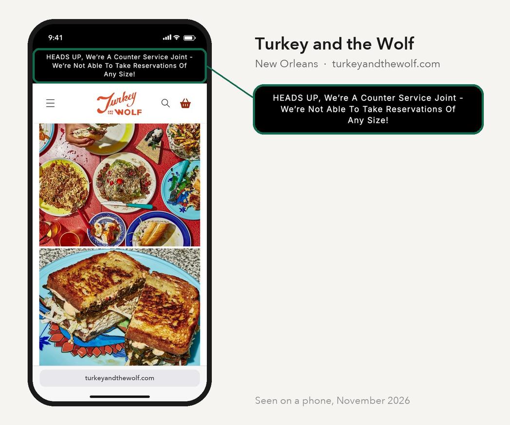
Turkey and the Wolf, also in New Orleans, answers the opposite way. A black banner above everything else says it is a counter service spot and takes no reservations of any size. So nobody spends ten minutes looking for a booking link that does not exist. Both banners save the guest a question and the staff a phone call.
Saint-Germain and Rolo's: keep the next step under the thumb
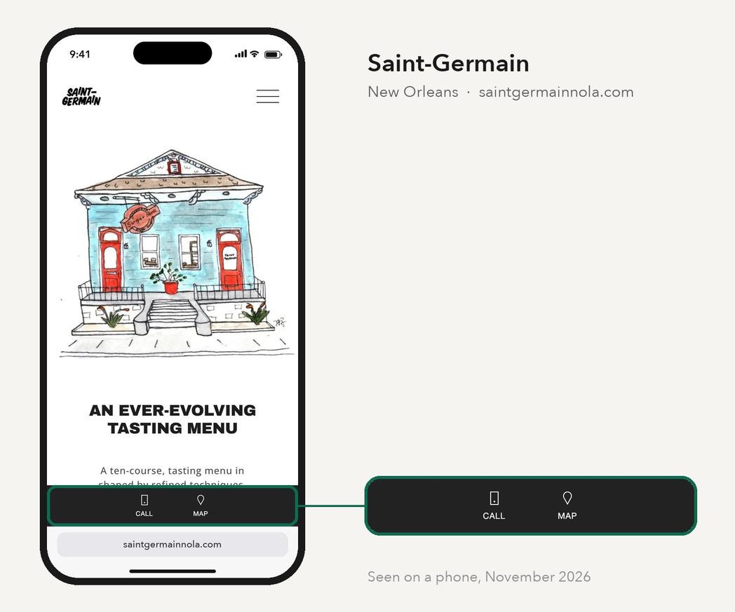
On a phone held in one hand, the top of the screen is the hardest place to reach, and the menu button hides everything inside it. Saint-Germain, a tasting-menu restaurant in New Orleans, pins Call and Map to the bottom of the screen, where a thumb already is.
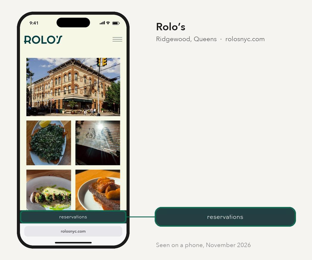
Rolo's, in Queens, pins Reservations the same way. The bar stays put while the guest scrolls the menu and the photos. So whenever they decide, the next step is one tap away. Pick the one or two actions that matter most for your restaurant, and only those.
Commander's Palace: one tap to a table
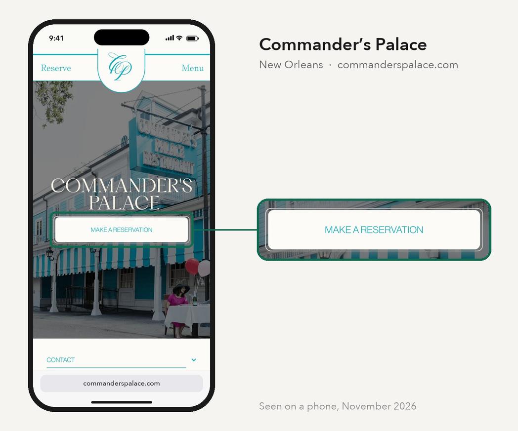
Commander's Palace is a New Orleans landmark, and its site still puts the booking first. Reserve sits in the top corner. A Make a Reservation button sits in the first screen, over a photo of the building. Both open the booking page on Tock directly.
A reserve button that leads to a page about reservations, which then links to the booking tool, loses people at every step. So send the button straight to the booking screen.
Lilia: say exactly where you are
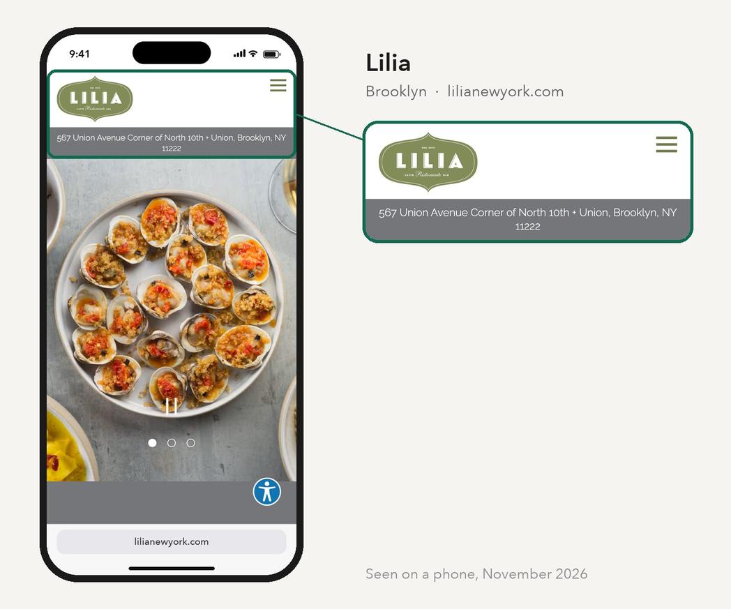
Lilia, in Brooklyn, puts its address in a strip right under the logo, with the cross street. It sits on Union Avenue, at the corner of North 10th. Tap the strip and it opens in Google Maps.
A cross street is how people actually find a door, whether they are walking, driving or telling a cab. It costs one line, and it answers the question before anyone opens a map app.
Odd Duck: answer the practical questions in plain text
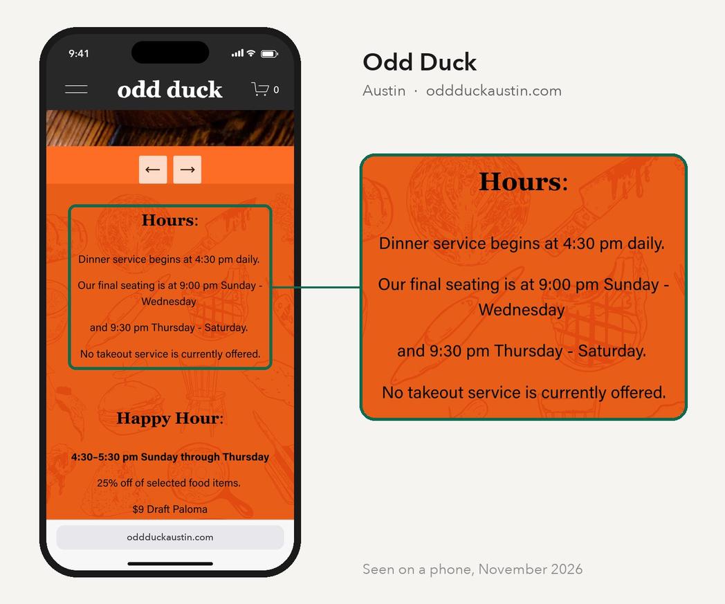
Odd Duck, in Austin, puts its hours on the homepage as plain text, and goes further than many. It gives the final seating time for each night, says it offers no takeout, and lists the happy hour, with the menus and prices as text too.
Each of those lines answers a question someone would otherwise call about. And because it is text, not a picture of a menu board, it works on any phone. A screen reader can read it aloud, and so can Google.
Kismet: say what you are in one line
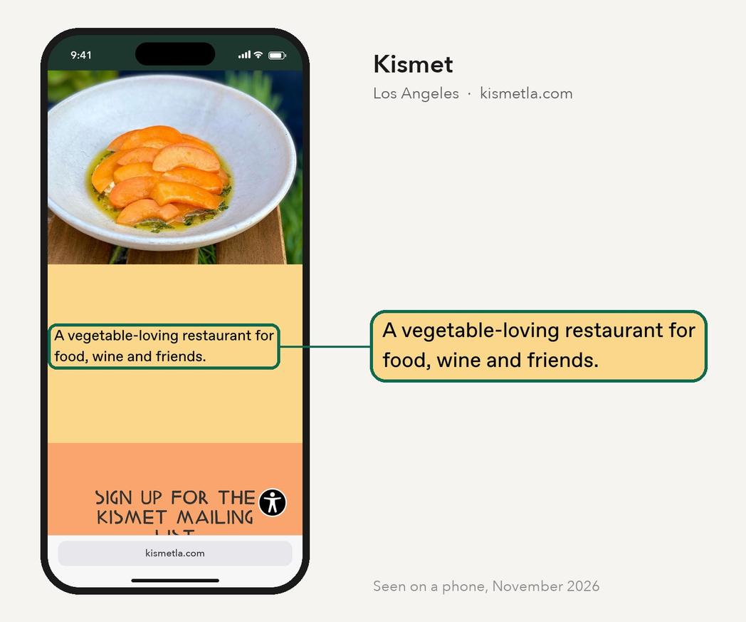
Kismet, in Los Angeles, describes itself in one sentence. It is a vegetable-loving restaurant for food, wine and friends. A stranger knows what kind of night it is before reading a menu.
Many restaurant sites open with a slogan, or with no description at all. Write the sentence you would say to a friend who asked what your place is like, and put it near the top.
The Grey: show the room, and tell the story in a sentence
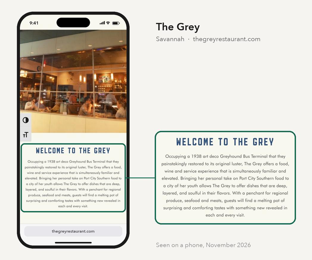
The Grey, in Savannah, opens on a photo of its dining room during service. Then it gives the one fact that makes it worth the trip. It occupies a 1938 art deco Greyhound bus terminal, restored to its original luster.
On a phone, one plate of food looks a lot like another. The room is what a guest is choosing for a birthday or a first date. So show it during service, and give one concrete detail about the place that nobody else can claim.
A Restaurant Homepage on a Phone, Top to Bottom
Put the moves above together and you get a homepage that answers the guest in order. This is a worked example, drawn for this guide, for a made-up restaurant.
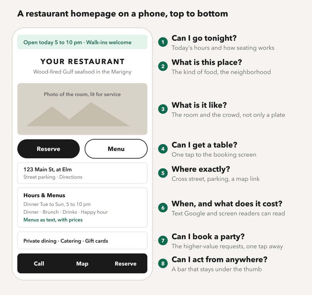
- A status line. Today's hours and how seating works, set from the same hours as your Google listing. It changes on holidays, so it has to be easy to edit.
- The name and one line. The kind of food and the neighborhood, in words a guest would use, set in the restaurant's own type and colors.
- The room. A photo taken during service. If you have one photo budget, spend it here.
- Two buttons. Reserve, or Order if that is how you work, and Menu. Not five.
- Where you are. The address with a cross street, a parking note, and a link that opens directions.
- Hours and menus as text. Every menu you serve, with prices, readable without a download.
- The bigger requests. Private dining, catering and gift cards are often worth more than a table for two, so they get a clear path from the homepage.
- A pinned bar. Call, Map and Reserve, always under the thumb.
What Every Restaurant Website Should Include
The homepage gets guests to a decision. The rest of the site handles everything after it. Here is what a restaurant website should include, page by page.
- Menus. Each menu you serve, as text, with prices and dietary notes. A PDF can sit beside it as a download.
- Hours and location. Regular hours, holiday hours, the address, parking, transit and accessibility notes.
- Reservations or ordering. A direct link to your booking or ordering tool, or a note that you do not take bookings.
- Private dining and events. Capacity, the kinds of events you host, and a short inquiry form that asks for the date, the party size and a contact.
- Your brand, carried through. The logo, type, colors and photography guests see in the room, used the same way on every page.
- About. Who runs it, the story in a paragraph, and press if you have it.
- Gift cards, careers and contact. Each one tap from the menu.
- The things guests cannot see. Fast loading on a phone, real text instead of images of text, readable contrast, and structured data that tells Google your hours, cuisine and menu. Google documents that markup for restaurants in its local business guide.
And leave two things out. A pop-up over the first screen, whether a mailing list, a promotion or a cookie banner, hides the hours from a hurried guest. Autoplay video or music costs load time and surprises people in quiet places.
Menus: Text First, PDF as an Extra
Many guests check the menu before they go, so the way it is published matters. A PDF menu is easy to upload, which is why so many restaurants use one. But a PDF opens as a separate file, zooms poorly on a phone and often reads badly with a screen reader.
Google's own guidance points the same way. Its advice for appearing in AI features in Search includes "making sure that important content is available in textual form". And Google may transcribe menu data from your website onto your Business Profile, which works best when the menu is clean text.
To be fair to the PDF, no controlled study shows that PDF menus cost bookings, and figures you may see quoted come from vendors selling menu tools. The case for text rests on reading, accessibility and Google. Commander's Palace shows the balance. Its menus are text, in tabs, and its full wine list is a PDF download for anyone who wants it.
Your Website and Your Google Listing Work Together
Many guests see your Google listing before your website, and some never click through. So the two have to agree. If your site says you close at 10 and Google says 9, a guest trusts neither.
Treat the website as the source of truth. Update hours, holiday closures and menus there, then make sure your Google Business Profile, Apple Maps and Yelp match. Google can pick up your menu from the site. Structured data on the site states your hours, cuisine and menu in a form Google reads. And reviews live on the listing, so the site's job is to back them up with accurate facts and a room that matches the photos.
Sometimes a new restaurant site does not appear in Google at all. The cause is usually foundational, such as indexing, a missing sitemap or a profile that is not linked. Why a new website is not showing up on Google walks through those checks. None of it guarantees a ranking.
How to Build One: a Builder, a Restaurant Platform or a Custom Site
There are four ways to get a restaurant website, and each suits a different restaurant. Prices below are as of November 2026, from each vendor's own page. These change often, so check before you sign.
- A general website builder. Squarespace starts at $25 a month paid monthly, or $19 a month billed annually. You get templates and full control, and you do the design, the writing and the upkeep yourself. Wix vs Squarespace vs WordPress compares the general builders.
- Your point-of-sale system's builder. Toast's website builder stays in sync with your Toast menu, online ordering and POS. It is the easy path if you already run on Toast. BentoBox, a long-time restaurant website builder, is now part of Clover and is currently sold only to Clover POS customers.
- A restaurant marketing platform. Popmenu runs from $159 to $449 a month, prepaid annually. Owner.com charges $249 a month plus a 5% fee per order, or $499 a month with no per-order fee. These bundle the site with online ordering and marketing tools, and they suit restaurants where takeout is a large share of sales.
- A custom site. Designed and built for one restaurant, priced by scope. It suits places where the room and the brand are the draw, and where the site has to carry events, several menus or more than one location.
When to Bring In Help
You can build a good restaurant website yourself. With one location, a short menu and a few free evenings, a builder template and the checklist above will get you most of the way. The writing and the photos take the most care.
Bring in help when the site has to do more than inform. That might be a brand the template cannot carry, or private dining that brings real revenue. It might be several menus that change by season, or a platform contract you want to leave. Or the Google listing, reviews and directory profiles all need fixing at once. Whoever you hire, ask them:
- Can my staff edit the menu, hours and photos without calling you?
- Will the menu be text, with a PDF only as an extra?
- Who owns the domain, the site and the accounts when we are done?
- Will you set up the Google Business Profile and structured data, and keep the hours in one place?
- How fast does it load on a phone, and can you show me?
- What happens after launch, and what does it cost to keep running? What a website costs to keep running lists the usual costs.
Where to go from here
If you want a site that does all of this, built around your room, that is the work I do. My restaurant website design package covers the site, the Google Business Profile, reviews and listings for one location, as one job. It has one published price, and your team can edit the site. Or tell me about your restaurant.
Questions People Ask
The Services Behind This
Want a restaurant website that works this way?